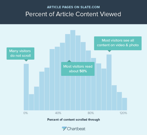
This is a histogram showing how far people scroll through Slate article pages. Each bar represents the share of people who stopped scrolling at a particular spot in the article. (An article is assumed to be around 2000 pixels long; if the top of your browser window gets to the 2000-pixel mark, you’re counted as scrolling 100 percent through the article. The X axis goes to 120 percent because on most pages, there’s usually stuff below the 2000-pixel mark, like the comments section.) This graph only includes people who spent any time engaging with the page at all–users who “bounced” from the page immediately after landing on it are not represented. The graph shows that many Slate readers do not scroll at all. That’s the spike at the 0 percent mark, representing about 5 percent of readers. Most visitors scroll about halfway through a typical Slate story. The spike near the end is an anomaly caused by pages containing photos and videos — on those pages, people scroll through the whole page.
 (No Ratings Yet)