Your landing page is one of the most vital elements of your digital marketing strategy. Creating a profitable landing page requires extensive testing. The biggest mistake that most marketers make isn’t neglecting to test their landing pages. The biggest mistake is focusing on the wrong elements.
When you are optimizing your landing pages, you need to focus on split testing the variables that affect your campaign the most. These are the factors that you should focus on the most.
Length of your content
Prevailing wisdom is that longer landing pages don’t convert well. Even some of the world’s leading authorities on landing page optimization, such as Tim Ash live by this principle. They argue that landing pages shouldn’t have more than 200 words of written content, because visitors hate reading online.
This may be true for many conversion goals and industries. However, it isn’t a universal truth. Some customers need more coaxing before they can be converted. In some cases, longer page copy converts much better.
Content doesn’t only mean words. It can be video and images as well that can help convey information more effectively. Harvard Business published an article that concluded B2B customers are no longer interested in salespeople selling solutions. Instead, they are persuaded by the solution with the best benefits for their needs. Confining yourself to a specific word count parameter isn’t what compels today’s buyers. Use as much content as is necessary to convey the benefits of your product or service.
Buzzsumo uses over 500 words along with various images to show the vast array of benefits of using their platform.
Incorporating value propositions into your call-to-action
Your call-to-action doesn’t take up much of your online real estate, but it can have a tremendous effect on your conversion rates. You should try to split testing a CTA with a generic message against a CTA that provides a stronger value proposition.
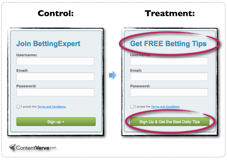
BettingExpert conducted a split-testing experiment with two different calls to action. Here are the two messages they tested:
“Join BettingExpert”
“Get FREE Betting Tips”
The second variation had a 31.54% higher conversion rate.
While crafting your own CTA, try to identify your strongest selling point. Split-test a CTA that includes it against one that has a more generic message. You maybe some very surprised with the results.
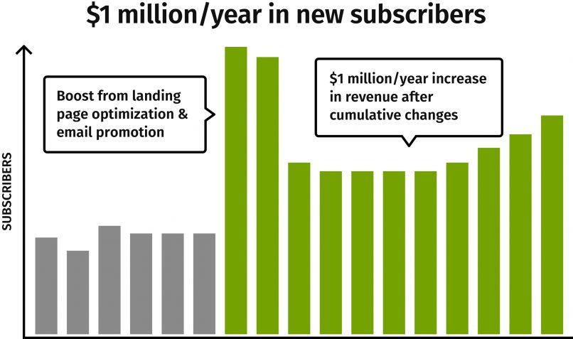
One Company worked with Moz to perfect their landing page. They were able to boost annual sales by $1 million. The biggest change they made was switching from a short form to long form landing page. This change alone lifted their conversion rates by over 50%.
The moral of the story is that you can’t design your landing pages around conventional wisdom. You need to test to find out what works. In some cases, longer pages simply work much better.
Test using images in a different way
Digital marketing veterans have observed that content marketing has become much more visual over the past few years. The growing influence of social media and sites like BuzzFeed has played a huge role in driving this trend.
Using quality images in your landing pages is important, but don’t take my word for it – test it!
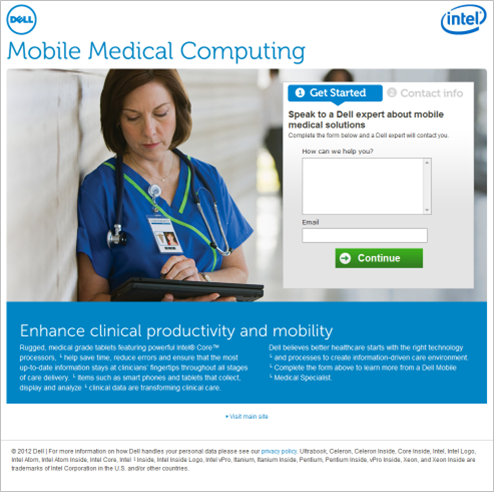
For example, Dell’s digital team wanted to increase conversion rates on their medical tablet landing pages. They decided to run an A/B test to compare lead generation of two landing page versions by sending PPC traffic to each.
Dell’s landing page A used smaller images and more text providing detailed content on the benefits and features of the product.
Dell’s landing page B scrapped all of the extra content resource links and replaced it with one mega-large background image, a large lead generation form and only the most important features and benefits of the product.
The test results were overwhelmingly in favor of landing page B, which saw an over 320% increase in leads. The clean design, large background image and clear call to action conveyed the right message for the medical community looking for this product.
With that said, just using larger images won’t always increase conversion rates alone. Using the right images that are compelling to your audience is just as (maybe even more) important than the size.
Make sure that you choose your images carefully. Some landing pages builders have over 1,000 stock images, but they may not be appropriate for your landing page goals. Test different variations of image size and type before you run any significant volume to your landing pages to ensure your conversion rates are optimized.
Focus on the most important variables of your landing pages!
Thousands of small elements can affect the conversion rates of your landing pages. However, it takes a lot of time and a huge budget to run that many split-tests. Rather than focusing on testing everything under the sun, you should test a few of the most influential variables. You will be surprised by how much a couple of changes can make on the long-term conversion rates of your landing pages.


Amazing tips! Couldn’t agree with you more.Landing page of a blog or a company’s website is something something that matters a lot. There is a saying “first impression is the last impression”, and if you have an exceptional landing page the chance of acquiring a greater amount of audience increases.Thanks!
Amazing tips! Couldn’t agree with you more. Landing page of a blog or a company’s website is something something that matters a lot. There is a saying “first impression is the last impression”, and if you have an exceptional landing page the chance of acquiring a greater amount of audience increases.Thanks!
Good one..
Thanks for sharing
Amazing tips! Couldn’t agree with you more.Landing page of a blog or a company’s website is something something that matters a lot. There is a saying “first impression is the last impression”, and if you have an exceptional landing page the chance of acquiring a greater amount of audience increases.Thanks!
-Shivangi, Marketing Head, RankWatch