The proposition of designing a new website or overhauling a dated one can be scary, to say the least. However, the good news is that you don’t need to overdo anything.
In 2016, simple, clean, and professional are the characteristics of choice.
Examples worth studying
We can talk all we want about web design, but it’s pretty useless without some visual representations to back up the claims being made. Throughout this article, we’re going to reference some of the characteristics of clean web design. As these characteristics are unpacked, the following examples and case studies will be referenced for your convenience. Check them out and see what you think.
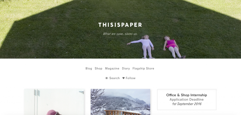
- Thisispaper. As unique as it is, the Thisispaper website is a fantastic example of clean web design and the value it yields across a variety of industries.
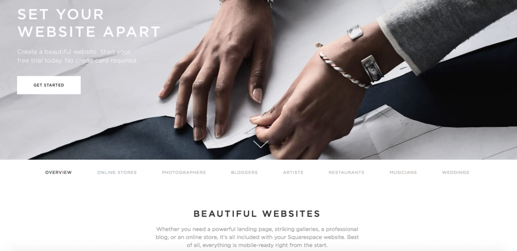
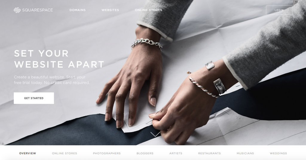
- Squarespace. It’s a myth that large websites can’t design minimalist sites that are clean and easy to navigate. Despite featuring thousands of pages, Squarespace is concrete proof that size has little to do with simplicity.
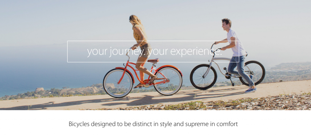
- Sixthreezero. This powerful website does an effective job of incorporating ecommerce elements into the homepage without adding clutter or compromising user experience.
There are literally thousands of other websites that could be referenced, but these three stand out and prove that it’s possible to achieve clean web design regardless of the application.
The 5 tenets of clean design
What is clean or minimalistic design? One of the best definitions comes from designer Shaun Cronin who has studied the evolution of web design for years.
“Minimalistic design tends to focus on stripping back superfluous and unessential elements to allow the content and core message of the site to take centre stage,” he explains.
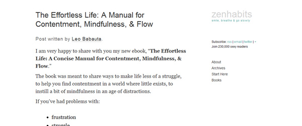
Zenhabits is a great example of minimalist design
“Every element should have a justifiable purpose. Minimalistic design by nature should be highly usable and functional, as there should be no distraction to compete with the information the site is trying to communicate.”
When you look at clean design in light of this statement, it suggests that the focus is less on removing and more on refining. In other words, everything on your site needs to serve a distinct purpose.
That being said, here are the core tenets of clean design.
1. Lots of negative space
Negative space is your friend. Notice how all three websites – Thisispaper, Squarespace, and Sixthreezero – use white space to establish continuity and put the mind at ease. In addition to establishing an enjoyable visual appearance, white space also naturally draws attention to the elements they wish to highlight.
Look at how much color “pops” against these clean backdrops:
Squarespace:
ThisIsPaper:
Sixthreezero:
It’s also important to note that negative space doesn’t have to be white. While white is most commonly used because it’s a pure color, black, grey, or virtually any soft pastel can be used to produce similar results.
2. Top-down flow of information
In 2016, clean web design tends to use scrolling features. (Both Thisispaper and Squarespace feature scrolling homepages.) The value in scrolling designs is that you’re able to disseminate information in a top-down fashion that makes it easier for visitors to consume.
Notice how Squarespace starts with the value proposition at the top of the page (“Set Your Website Apart”) and then goes on to highlight each of the individual features that play into the proposition (beautiful websites, all-in-one platform, powerful yet simple, etc.).
This stands in stark contrast to websites in the early 2000s that tried to cram as much information as possible above the header.
3. Large visuals
All three sites do a good job using large, compelling visuals to engage visitors. Sixthreezero’s design is especially noteworthy, as it uses bright colors to accent certain features.
While the entire banner image at the top is beautiful, the visitor’s eye is immediately drawn to the bicycle the girl is riding. This naturally flows into the product selection and allows for a rather seamless transition.
Thisispaper uses large visuals throughout. In addition to the banner image at the top, high-resolution images of varying sizes are used to captivate visitors and spark their curiosity. This curiosity is then used to transition interest into the Thisispaper Shop.
4. Customer typography
Something most web designers rarely think about is typography. However, this is becoming a very important element. From a visitor’s perspective, typography has a huge subconscious impact on how brand messages are received. You can read more about the effect typography has on user experience and conversions by checking out this study.
Thisispaper uses a very familiar looking font to offset the peculiar visuals that are displayed on the site. Squarespace uses bold lettering to compliment its value proposition.
Sixthreezero’s font is friendly and adventurous, which is characteristic of the brand:
Notice how they use all lower case lettering in the value proposition at the beginning. This reinforces the idea that Sixthreezero is unique.
5. Plenty of contrast
Contrast is very important. While any designer can use negative space and cut down on clutter, it takes a strategic eye for contrast to create a site that truly connects with visitors. All three of the examples in this article do an outstanding job of juxtaposing various elements against simple backgrounds.
Thisispaper uses shadows and plays with light angles in images to produce a contrasting appearance (especially in the banner image). Squarespace uses the classic contrast of black on white to create powerful dissimilarity. Sixthreezero opts to use color against its predominantly white background. All use different techniques, but they all have a similar effect.
Putting it all together
As you can see, clean web design isn’t as intimidating or challenging as you may have previously believed. By focusing on reducing clutter and engaging visitors via powerful visuals, you can enjoy the many benefits of simpler on-site experiences.
At first, it may seem impossible to overhaul your existing site design, but avoid taking such a vast approach. Instead, look at individual elements of your site and ask how you can simplify over time. A gradual approach will yield positive results in very little time.
If you want to get 30 effective techniques to master content marketing along with valuable insights from 10+ influencers like Mark Schaefer, Rebecca Lieb, Lee Odden, Jason Miller or Ian Cleary, download our free eBook now!

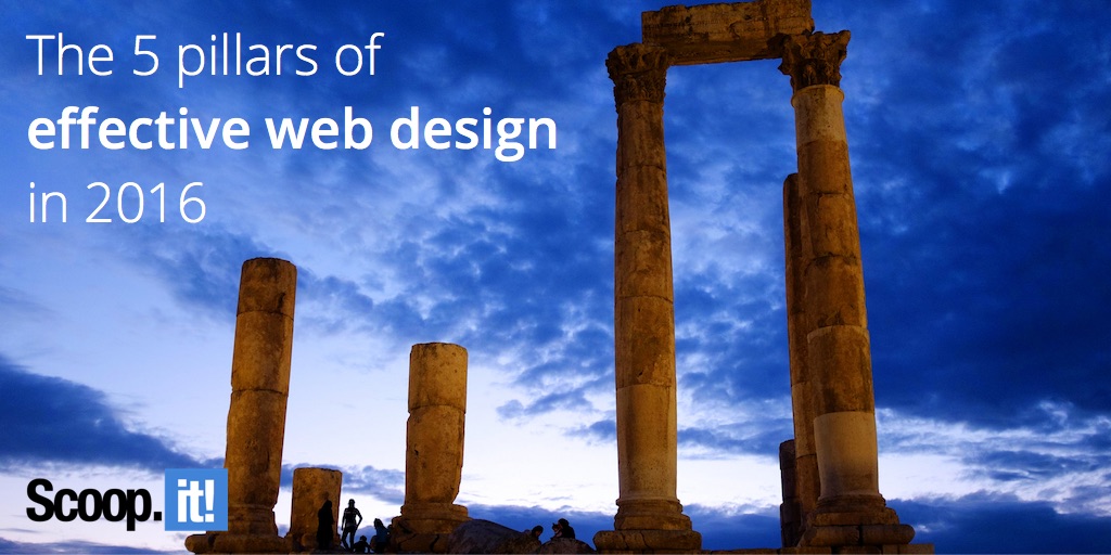
Image by Mahmood Salam
 (2 votes, average: 5.00 out of 5)
Having a clean design for your website has its advantage because it makes it easier to find relevant content, the navigation bar and social media icons, among other important elements.
Do these rules apply for lawyer websites, since the audience is a lot different and the goals are more content oriented?