Editor’s Note: At Scoop.it, we believe that the form (the way something is presented) affects the function (the physical use of something) of content engagement online. It is becoming increasingly important to look pretty if you want to drive traffic — the endless streams of pretty pictures on Pinterest is testament to this, and we all know that if a webpage has 6 pt font, we probably won’t read it.
This article notes a few modern web trends to keep in mind during your curation.
The internet landscape is constantly changing and graphic designers have to keep up with the trends to stay competitive. So, take a look at these six graphic design trends for websites in 2013 and why they’re happening.
Typography to Express Emotion
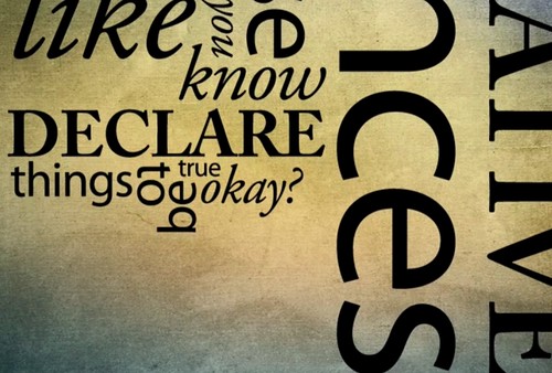
Image via Flickr by Son of Groucho For a while, graphic designers focused on choosing fonts that were easy to read on the web. This usually meant using one of the sans-serif fonts, such as Arial or Calibri. However, now the trend is to choose fonts that convey emotion and more closely match the tone of the website. For instance, it would be appropriate to see spaghetti-like font on a recipe website or flowery, curvy font on a mommy blog. Designers should still stick to fonts that are easy to readfor the bulk of their website content, but have fun with the typography of the headings and page titles. There are several “modular construction kits” that help with the design of fonts, whether that is creating something that looks like it’s handwritten for a humanizing effect, something bold and chunky to draw the eye, or old-school calligraphy to create a nostalgic feel.
Interactive Designs and Unconventional Navigation
Websites used to be pressured to stick with the conventional navigation of a bar across the top with tabs. However, a new design trend is to use a creative navigation design that’s interactive where readers have to click on certain objects to take them to a different page. For instance, a recipe website could have a collage of food — sweets, drinks, breads, veggie meals, etc. Then, when a reader clicks on a certain object, it takes them to the corresponding recipe page. This is particularly popular right now because of touchscreens. It engages the reader more, whether they’re using a smartphone, tablet, or chunky desktop computer.
3D Illustrations and Textures
 Image via Flickr by Richard Almond Another trend in web design right now is the use of bold images and textures. Designers avoided this in the past because the images took too long to load, causing more people to bounce from the website. However, technology has advanced enough that the load time isn’t noticeable, even if websites use a large image as the background for the entire website. This gives designers a lot more flexibility to create custom images and designs. Of course, designers aren’t just using more images; they are adding 3D elements and textures to their images. 3D technology has been an emerging trend in web design since 3D movies became popular on the big screen. They make a website really pop and draw attention. Use shadows, contrast, and other design elements to create texture. Some tools that can help include Patternizerand Online 3D Sketch Tool.
Vibrant and Bold Color Combinations
 Image via Flickrby Dave Hosford Color trends are always changing in web design. Right now it’s common to see bold and vibrant colors in various shades and combinations. Gone are the days of blue and gray shades with light backgrounds and dark fonts. There really are no rules anymore as far as colors. The more unique a designer can make a website look, the better. However, it’s still very common to incorporate brand colors in the web design.
Infographics Instead of Written Content
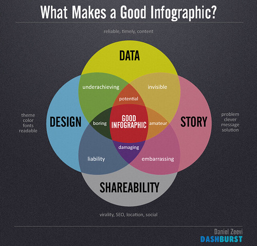
 Image via Flickr by Daniel Zeevi People read content on the Internet a lot differently than in print. For instance, a person could spend upwards of 10 hours reading a book, but they would never pour over content online as intently. Internet readers are skimmers and their eyes are drawn to things that are visually appealing. That’s why infographics are a rapidly growing design trend. Designers are frequently asked to turn content into pictures to keep readers on websites longer. Infographics become part of the website’s design and the trend is expected to grow.
Fewer Ad Blocks in the Design
A major way that many websites make money is through hosted ads, but readers are turned off by websites that are loaded with them. That’s why designers are getting creative with ad placements, such as incorporating them into the content. Designers should focus on creating websites that are pleasing to the eye and implement ad space as an afterthought. These are just some of the most popular graphic design trends for websites that we’re seeing in 2013. It will be interesting to see what trends happen next year and in ten years. Do you have any predictions? Leave them in the comments below. To learn more about customizing your scoops and topic pages, please click here.
If you want to get 30 effective techniques to master content marketing along with valuable insights from 10+ influencers like Mark Schaefer, Rebecca Lieb, Lee Odden, Jason Miller or Ian Cleary, download our free eBook now!


thanks for the useful tips on graphics designing trends. I am web designer, and these tips seems to be very useful for a designer..
Any suggestion on how education web design should look like or the trend for e learning company.
I think giant image backgrounds should have been included in this list. I’m seeing them everywhere! That, and flat design combined with illustration.
please sugges me for e-comm site