“Read more now!” “Get it today!” “Get your free copy here.”
If you’ve spent any time online, chances are you know why these calls-to-action (CTAs) are so effective. When it comes to CTAs, there’s a right way and a wrong way to do them and the right way is a whole lot more effective.
If you’ve been struggling to know what makes people click, to produce conversions for your site or you’re simply seeking to beef up your CTA game, the first step is learning about what makes a CTA effective and which CTA formulas produce the best results.
The 4 Foundations of a Good CTA
In order to be effective, your CTA needs to possess the following basic characteristics:
- It needs to be recognizable. If someone gets to your page only to find a mashup of marketing hype and confusing directions, they’re going to get frustrated and leave before they even find your CTA. This is true for landing pages, blog posts, etc. To combat this, ensure that your CTA is a recognizable format (a plain line of text, for example, or a CTA button) and that it fits logically into context – a blog post about a topic related to your eBook should feature a CTA that drives people to purchase said book, for example. This helps people recognize the CTA and interact with it appropriately.
- It needs to be interesting. In order to be valuable and clickable, your CTA needs to be interesting. This means that it should have compelling commands that are straightforward, attention grabbing and short. Keep CTAs under 10-15 words for maximum effect and don’t try to reinvent the wheel with fancy phrases or over-the-top design. Words like “now,” “today” and “get” work well. Remember: a CTA is not a place to test new marketing tactics – it’s a place to draw readers in and produce conversions.
- It needs to be logical. Did you just write a great blog post and you want it to drive readers to purchase enroll in your online class? Great! Don’t put your CTA on your homepage then. Instead, place it at the end of your blog post, where interested readers will already be. This is logical placement at its finest. In order to be effective, a CTA needs to be located in the place that the reader is most likely to look next.
- It needs to be visible. This goes hand in hand with placing the CTA in a logical location. Just like you shouldn’t place it on your homepage, you also shouldn’t place it within the blog text, buried among paragraphs and sub headers. This creates unneeded competition for the CTA and confusion for the reader – do I click here? Do I keep reading? What’s going on? Where do I go next? Avoid this by making the CTA a standalone unit, surrounded by ample white space. You can do this by placing it in a box all its own or by simply separating it with a line break from the end of your text. No matter what you do, the CTA should shine all by itself.
Writing Great CTA: 9 Tactics That Work
When it comes time to write your own irresistible CTAs, you should know that there are a few tried-and-true tactics that work every time. These tactics work by appealing to different aspects of the human psyche to increase urgency, promote a feeling of scarcity, build excitement or promote the usefulness or value of a product, good or service. Try these fun CTA formulas on for size:
1. Offer more information
If people have stayed at your page long enough to click your CTA, it’s likely they enjoy what they’ve seen. This was my #1 rule in creating the popup for my upcoming book, which comes up on our blog after you’ve been hanging around a while.
In light of this, a CTA like “Learn more” works because it’s short, to the point and interesting. Its crowning factor, however, is that it provides the reader with exactly what they want: more high-quality information. Chances are, you’ve given them enough information before this point to ensure that they’re hungry for more. When a reader is in this position, they likely already trust you as a valuable source of information, which means they are much, much more likely to click the “learn more” CTA and be happily re-directed to other portions of your site to do just that. Keep in mind that this CTA is ideal for people who are utilizing a multi-step sales funnel to drive readers to purchase a product.
2. Issue a command
When it comes to CTAs, there is no overestimating the importance of a direct, actionable command that tells people exactly what to do. A CTA like “Start now” with a brief phrase about what you want to do/learn/act on is absolutely ideal for companies with limited space inside their CTA button or companies that need to provoke higher signups, more downloads or similar customer engagement. Keep in mind, though, that if you’re going to use this CTA, you need to provide enough educational content on your site that your customers know what exactly they’re signing up for. I’d even refer you to the header you’ll see on Scoop.it’s blog (they’re doing it right!)—
Part of the reason that CTAs using any version of “Act now” or “Start now” appeal to the responsiveness instinct in people. What this means is that, by reinforcing a person’s image of themselves as a timely, prompt, responsive person, you can actually help direct their behavior in that direction. Because people like to think of themselves as responsive, organized and prompt, they act in ways that reinforce these images. Therefore, a CTA saying “Act now” is likely to prompt your readers to do just that.
3. Offer a trial of your product
When it comes to conversion rates, free trials produce the most signups. According to a test done by QuickSprout, within which Neil Patel tested several different CTAs involving money-back guarantees or free trials, the offer of a free trial literally doubled the number of people who signed up for his Traffic Systems course. The reason for this is likely due to the fact that the word “try” doesn’t carry all of the commitment of a term like “subscribe” or “buy.” A person can try anything and stop if they don’t like it. You could try having purple hair, for example, because “trying” doesn’t mean you’re married to it. Because of this, the offer of a free trial is a great way to snag customers who may otherwise be on the fence about your product. Plus, once they’ve tried it, they’re much more likely to stay.
4. Convey a sense of urgency
Anyone who has ever seen an infomercial knows that one of the primary tactics those commercials use is the “hurry – time is running out!” scheme. Although infomercials are a somewhat archaic form of marketing, the infomercial writers are onto something in that by urging their customers to purchase now. Conveying a sense of urgency when marketing a product is a great way to inspire excitement and competition in customers. While you certainly don’t need to tell your readers that supplies are running out (unless, of course, it’s true) you can certainly throw out a CTA that says something to the effect of “order X today.” The word “today” works very similarly to the word “now” in that it makes the promise seem much more immediate and offers a sense of urgency for the product.
Another great way to do this is, especially if you’re offering a class, webinar or lecture, is to limit spots to in order to increase their power. This works because it raises the perceived value of whatever you’re offering. When a customer believes that the perceived value of something is low, either because it’s low-quality or because there is more than enough of it to go around (which leads to an “oh, I’ll buy it later” mentality), they aren’t very likely to make a purchase. When the perceived value is high, however, the customer is more willing to pay a good deal of money or make a quick decision for the product, which leads to more sales and more customer demand.
Creating a sense of urgency is so important in marketing because it stimulates a sense of loss aversion in people. Loss aversion is the psychological theory that states that people care about not losing things more than they care about gaining something new. Therefore, making a user feel like they’re going to lose anything by not responding is a great way to get them to respond.
5. Offer anything free
Customers love to get a great deal and offering them anything for free is a fantastic way to spike interest and produce a higher number of conversions. The only drawback of this CTA, of course, is that you’ll actually need to have something to offer them for free. Ebooks work wonderfully for this, as do trials of service, webinars or access to videos.
6. Engage the need for discovery
By using a CTA like “see how it works” or “try it out now,” you can achieve the same commitment-free effect as the free trial with the added bonus of also offering your customers the chance to discover something new and get involved with your product. This is especially efficient if you create a situation in which the offer could potentially be pulled away. This inspires people to act quickly.
7. Show users that time is passing
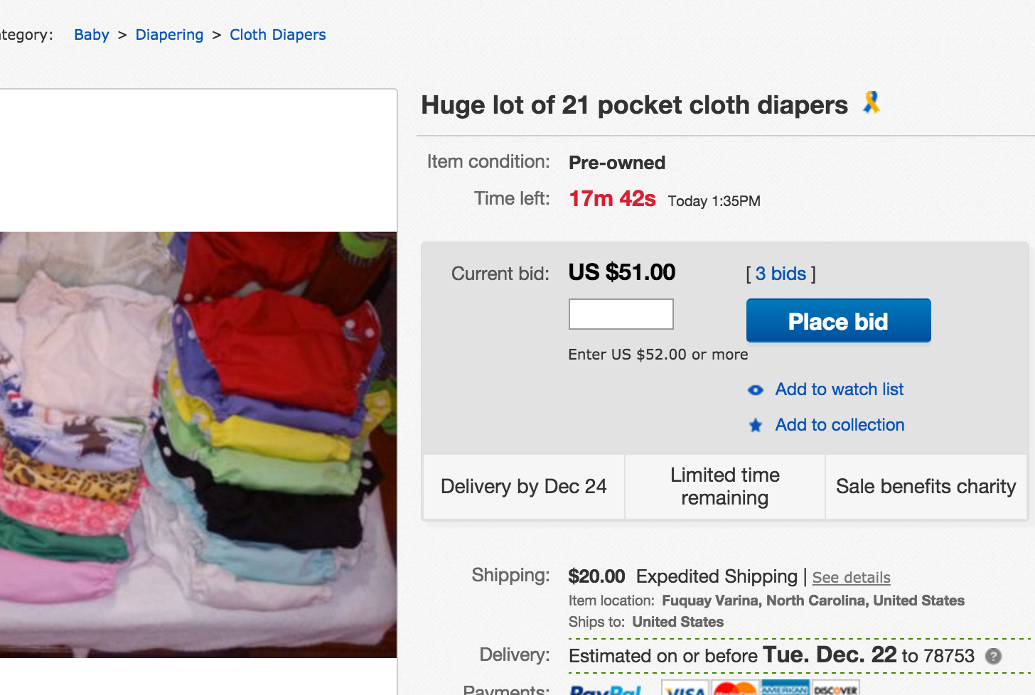
There’s nothing that more obviously conveys time than a clock. When you remind your readers that time is passing, they’re much more likely to take the plunge rather than taking their time to consider the product. Think about eBay, for example. When users see the small red numbers ticking closer and closer to zero, it makes them make decisions much quicker.

8. Make it difficult
In psychology, there’s something called the theory of effort justification. This states that the value of something is greater if a person works harder for it. This is the theory behind allowances during childhood – when you mow 10 lawns for $50, you value that $50 much more than you would have if somebody had just given it to you. This holds true in marketing, as well. When somebody works hard to take action, the value of the prospect automatically goes up.
9. Solve a problem
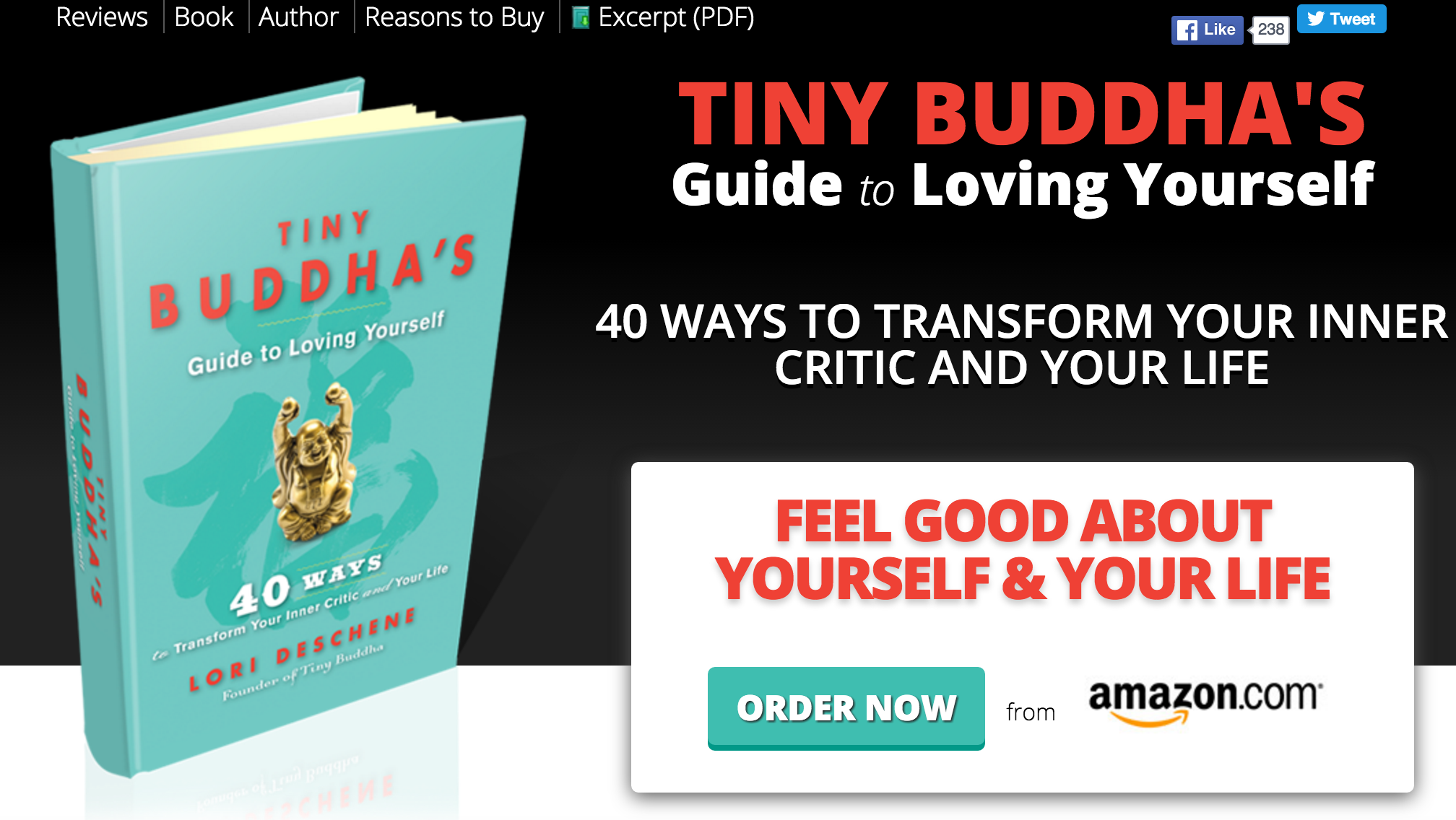
If you were in the newspaper business, you’d know the saying “if it bleeds, it leads.” This means that headlines that are tragic or especially heartwarming draw a large response from audiences and often earn front-page spots. Similarly, negative situations in a person’s life breed rapid responses. One of the main goals of high-quality online marketing is to solve a consumer’s problems or difficulties. Therefore, a CTA that is targeted toward a specific audience’s unique struggles will create higher click-through when it offers to solve a problem. Popular lifestyle and self-help site TinyBuddha.com uses this CTA in marketing their offer for the Tiny Buddha Guide to Loving Yourself:

When it comes to web success, one of the greatest ways to give your site a boost is to step up your CTA game to the next level. By writing great CTAs, you stand to make your site stand out, create urgency, excite your customers and create more conversions than you ever thought possible.
By understanding what makes a great CTA and seeking to incorporate tried-and-true CTA formulas into your site, you stand to transform your traffic and make people click – pun intended.
Download my PDF for 10 proven CTA phrases that work every time (and 25 hot email headlines).
And if you’d like to see how content curation can help you improve SEO, you should read this eBook!


 (3 votes, average: 3.67 out of 5)
Pretty valuable insight, Julia. I was wondering if you/scoop.it had any metrics on which CTA receives more clicks: copy with linked text, a button, or an image?
Great question @@disqus_THqckJ1h5b:disqus – Not sure if Julia has an answer but definitely a topic I’d like to investigate.
You’re doing great imho, Tony 😉 But the data will tell you!