
Email marketing has never been optional for any internet marketer. Sure, some have successfully avoided it and undergone shortcuts like buying email lists and what not’s, but in the wake of the EU’S GDPR law, that will have terrible consequences.
For marketers trying to get it right, sometimes designing emails might seem daunting, especially when you’re not a designer. Thankfully, many email clients have templates to minimize your design woes. Still, because some can boast of over 500 templates, it gets complicated all over again.
Don’t worry. In this post you’ll find four tips to stop you from worrying about your email newsletter design ever again.
1. Make your newsletter responsive
More people are using their mobile devices to open their emails. In fact, one study by Fluent shows that about 73 percent of people aged 18 to 24 use their phone to check emails. An Adobe study also revealed that smartphones are used by 75% of people aged 18 to 34 to check emails.
Apart from those age-specific reports, two-thirds of emails are opened on mobile devices.
When you design emails, make them responsive, i.e emails that can detect a visitor’s screen size and orientation and change the layout accordingly. For example, consider this email from Google. This is what it looks like on desktop.
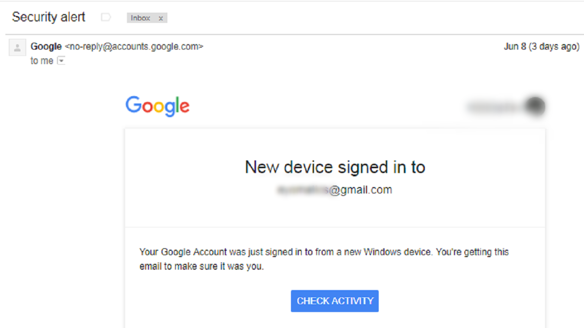
And here’s what it looks like on my mobile device.
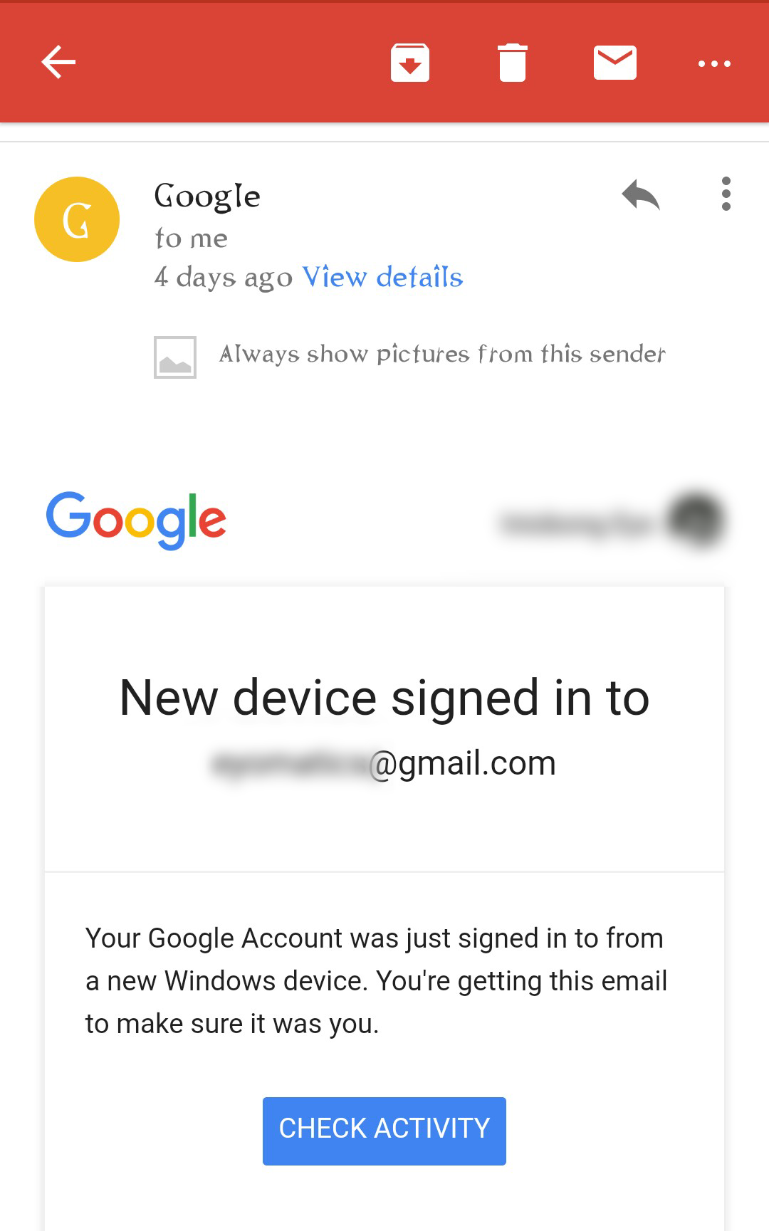
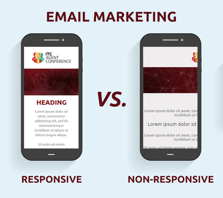
You’ll notice the layout changes to fit my mobile phone’s screen and I don’t have to move to the left or right to see missing parts of the email. To illustrate that simply, here’s a responsive and non-responsive email side-by-side.
Source: ITC
If you can’t create a responsive email template, it’s advisable that you use a simple template that works for all mobile devices.
2. Keep it clean and organized
Sometimes marketers overlook this, since everyone is talking about how important pictures or visuals are generally for content. Some marketers overdo the visuals to the point where it makes no sense. Consider this email below.
Source: MailJet
Terrible probably doesn’t begin to describe the horror show above. Different font sizes and styles. Different colors. Plenty calls-to-action. If you’re anything like me, you’ll ignore or send it to trash as soon as possible.
But as a marketer, is that the type of reaction you want to elicit from your audience? Definitely not. Because if it’s a sales email like the above example is, it will affect your conversion rate negatively.
Compare the email above to this one.
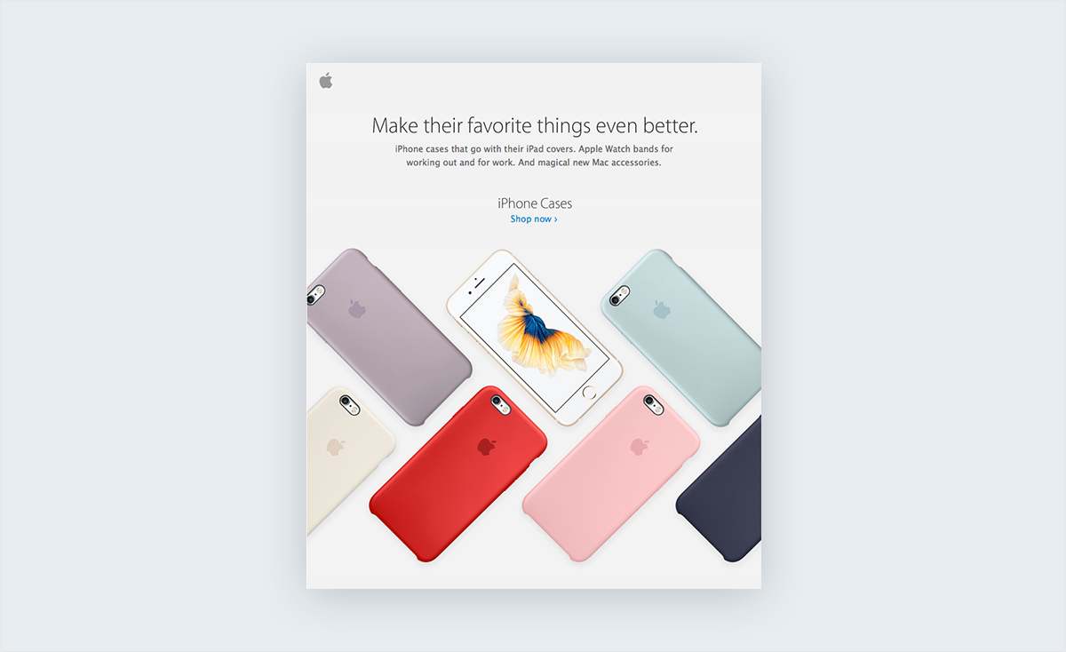
Source: Pinterest
Of course, Apple sells other iPhone and Mac accessories, but in this email, they highlight only their colorful iPhone cases. Their “shop now” call-to-action could have been more prominent, but overall, it’s a great example of a clean and organized email design.
Eliminate needless clutter and information from your emails. When you do, chances are your subscribers won’t be distracted and will actually click through to perform the action you want them to. Whether that’s reading your blog post or purchasing from you, it won’t happen if they’re too confused about the next step(s) to take.
3. Use the right color scheme
Lots of research has shown that certain colors evoke certain feelings and emotions. Some colors in CTAs improve conversion rate more than other colors. And men and women generally prefer different colors.
This is a chart showing colors both genders like and dislike.
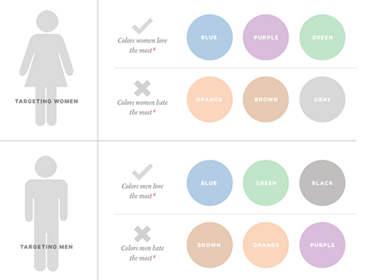
Source: Kissmetrics
For example, the color yellow is a color of warning. Blue is associated with traits like loyalty, integrity, transparency, and trust. Little wonder popular brands like PayPal, Buffer, and Facebook all use the color blue. I can go on and on, but the point is, the colors you use will affect your subscribers’ reactions to your email newsletters.
Also, when you send emails, try to make your call-to-action stand out. For good results when designing emails, “you could use a white background for the bulk of your email and then have a colored box for your CTA.”
Here it is in action.
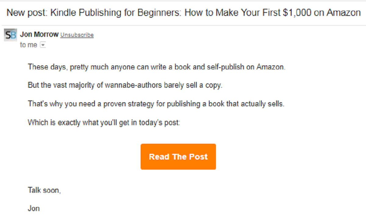
The orange CTA stands out in this email from Jon Morrow
Also, when you look at the examples I gave earlier using Google, you’ll see that their blue CTA upholds and enriches their brand identity. You can also choose to use a CTA that complements your brand.
4. Use images and infographics
You’ve already seen bazillion statistics on why images and visuals are useful for content creation, so I won’t rehash them here. I’ll just build on what you already know.
With visuals, there are endless possibilities. You can create your own images or you can get images from a stock image site for your newsletters. Also, memes are popular now and can make a good addition to your visual strategy. As usual, strike a balance and don’t overdo it.
Use descriptive alt tags, because some email clients on desktop and mobile do not display images unless the recipient clicks “display images” or something similar. You do not what your image to look like this one I once received.
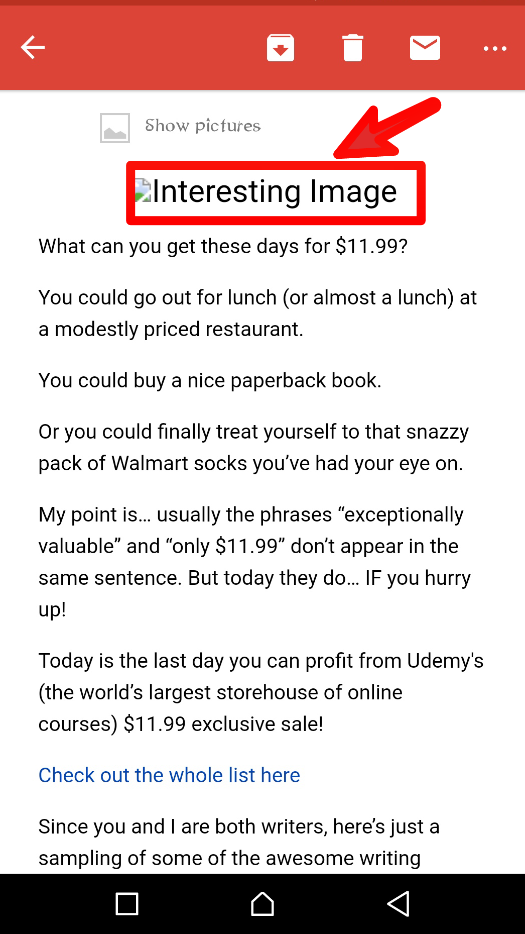
Everyone thinks their image is interesting, why is yours interesting?
Use alt tags that will make readers of your newsletter long to see your images or better still always display images from your email address.
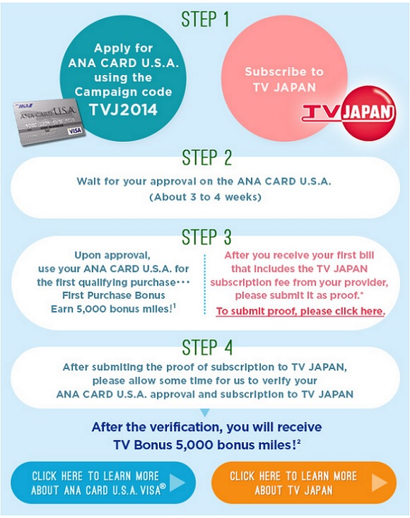
Not to be ignored too are infographics. Eye-tracking studies have shown that people pay close attention to images with information. You can make infographics about processes and how-tos, maps, timelines, lists, comparisons, etc. Here’s an example of an infographic newsletter from TV Japan.
Source: Campaign Monitor
Be more deliberate with your visuals when sending newsletters.
Practice, practice, and practice
After reading these tips, I’m sure you’ll try them with your newsletters. But one common thing about email marketing and internet marketing generally is that though there are best practices you should follow, you may still need to tweak things a bit to suit with your unique circumstances.
Test your emails–your calls-to-action, your subject lines, and even the length of your emails. Eventually, you’ll not only increase engagement among your subscribers but you’ll find it easier to motivate them to act. That’s how you’ll reach your email marketing objectives.


 (2 votes, average: 3.00 out of 5)