Content curation isn’t merely about plotting out various audiences or researching about your users’ interests. There’s a ton more to content curation. And web accessibility for all users is one of them. That means taking into consideration the 1 out of 6 visitors to your website with disability. Read on to find out why it is essential to do so.
- Improves conversion and bounce rates
More than 71 percent of users with disabilities will leave a site that is not accessible to them. The result is an increase in bounce rates and an obvious loss of money-making opportunities on your website. In fact, an analysis by the UK government in 2016 found that websites lost a whopping £11 billion annually from bounce rates associated with people with disabilities.
As such, infusing elements accessibility into your content curation strategy can go a long way in helping you reduce bounce rates.
- Leads to increased traffic to your website as a trusted source
Most people say that you have to earn trust. These words have never been more accurate. By making your website accessible, you show your users that you care for and appreciate them. It would be best if you used web accessibility to build trust with your users.
You can drive more traffic if your site is authoritative and accessible to all users. That overlaps with other suitable practices such as usability, SEO, and mobile web design.
- It makes it easier for disabled persons to do business with you
At least 82 percent of disabled persons agree that they will spend more on an accessible site. That is regardless of the cost of services or the price tag behind products. That’s because they can do business with ease. They can also access the information on the site and make informed decisions.
An accessible website breaks the barriers of audio, visual content, and print using web technologies. Regardless of the type of disability that a user has, it will not hinder them from interacting with your website.
- A strategic way to prevent ADA lawsuits against your site
While it’s easy to assume that only the government or big businesses need to make their websites more accessible, small businesses must fall in line too. It doesn’t matter whether you are running a charity website or a public or private one. The fact is failure to comply with the provisions of the ADA may land your business in trouble with the law.
Over 2000 cases of ADA lawsuits are reported yearly. To prevent your website from being a statistic, ensure that it’s ADA compliant. That will save you the headache of dealing with lawsuits and both time and money.
- Gives your business a social impact
Running a business is not just about driving traffic and chasing leads. It’s also about making a difference in the community and those around you. And what better way to do that than to join the fight towards equal opportunities and access.
Your website can be an excellent place to start. That way, your users with disabilities can participate more actively in society.
How to make your website more accessible
Making your website accessible is not as challenging as it may first appear. With the right tips and tricks, you can improve accessibility for your site. Here are some of the steps that you should take.
Use descriptive link text
When curating your content, always ensure that you add descriptive texts to the links. Sure, adding color to it and underlying the links is important. But what about your audience with poor vision, color blindness, or those in poorly lit areas who can’t tell the link has color?
Descriptive texts like ‘Watch YouTube Video’ are easy to understand since they go straight to the point. Your audience does not have to wonder where the link is taking them. Plus, if your link requires the audience to download the link, you can let them know by clearly stating what they are to download.
Also, since most people use screen readers, avoid writing out the complete URL as the link text. It’s frustrating, looks clunky, and undoubtedly annoying (the screen reader will read it letter for letter).
Use simple language
One most valuable content curation strategy is using short, simple sentences. A lot of people only skim through content. So make it as skimmable as possible. If you have a problem with keeping your text short, you can use simplifying tools.
These tools replace complex vocabulary with simple ones and help you summarize your text. That way, anyone can understand your content, including people with cognitive impairment.
Format your content for access
Laying out your curated content in a clear and intuitive way can make it more accessible. That way, people can flow through it naturally and connect different sections of your content seamlessly. You can achieve all these by using simple formatting tips.
For instance, using straightforward and easy-to-read Non-Serif fonts can make a whole load of difference. Plus, you can use large, easy-to-click links that spell out the action the reader is taking by clicking.
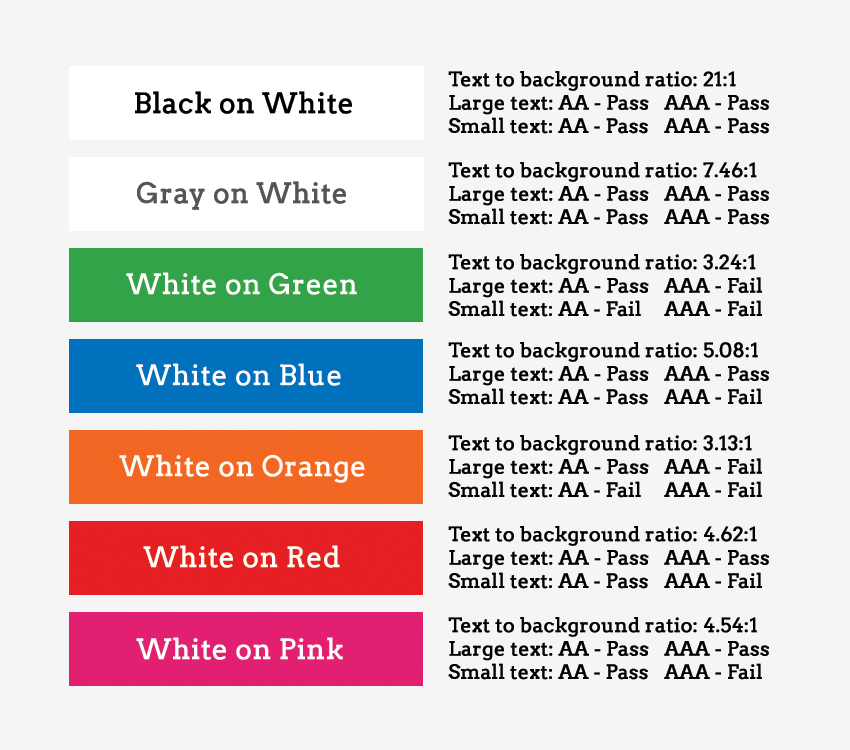
Additionally, you can add as much color and contrast to your content. That way, people with limited vision or in low light won’t struggle to access it.
Use clear hierarchy
If anyone in your audience uses screen readers (which is more than 4.4 million Americans), they depend on a clear hierarchy to understand the content. That’s why HTML tags in hierarchical headings that clearly show subheadings and titles are essential.
Make accessibility easy to find
When you add an accessibility feature to your website, the goal is to help users quickly navigate your site. But what use is it if they cannot find the feature? For instance, instead of having the accessibility page tacked away and only accessible when someone searches on Google, you can make it available on the main page.
Let users know where to go if they need to activate (or turn off) a specific feature. Ensure that the page spells out every single essential information.
Caption and transcript your videos
Currently, video content is popular due to its engagement levels. However, a disabled user who is hard of hearing will have trouble accessing your content. No, subtitles don’t do the trick because the design was for people who can hear but are noisy or do not understand the language. It always leaves out some of the primary audio information like car honks, among others.
Captions, on the other hand, capture even the little audio details. That way, users can access the information better and completely. Transcripts also allow the same level of access without neglecting anything.
Simplify essential tools
Tools such as autocomplete for filling forms should not be too complicated. Instead, the user should only need to take the necessary steps to complete the action. For you to accomplish that level of functionality, you need to understand each user.
For instance, for a visually impaired user to access the tools on your site, you can include a reader. That way, they do not need to worry about typing. Even so, you may not get the tools right on the first go. But with more iterations and improvements, you can fix as many bugs as possible.
Enlarge the clickable areas
Some of the visitors to your site may have a combination of disabilities and may fail to navigate the site if everything is small. That is where the real challenge begins. The goal is to enlarge the size of your content and clickable links without making the site less adaptive.
You should ensure that your site is adaptive while increasing the hyperlinks’ size to cover more text. Users can then comfortably navigate the site regardless of their limitations, physical or otherwise.
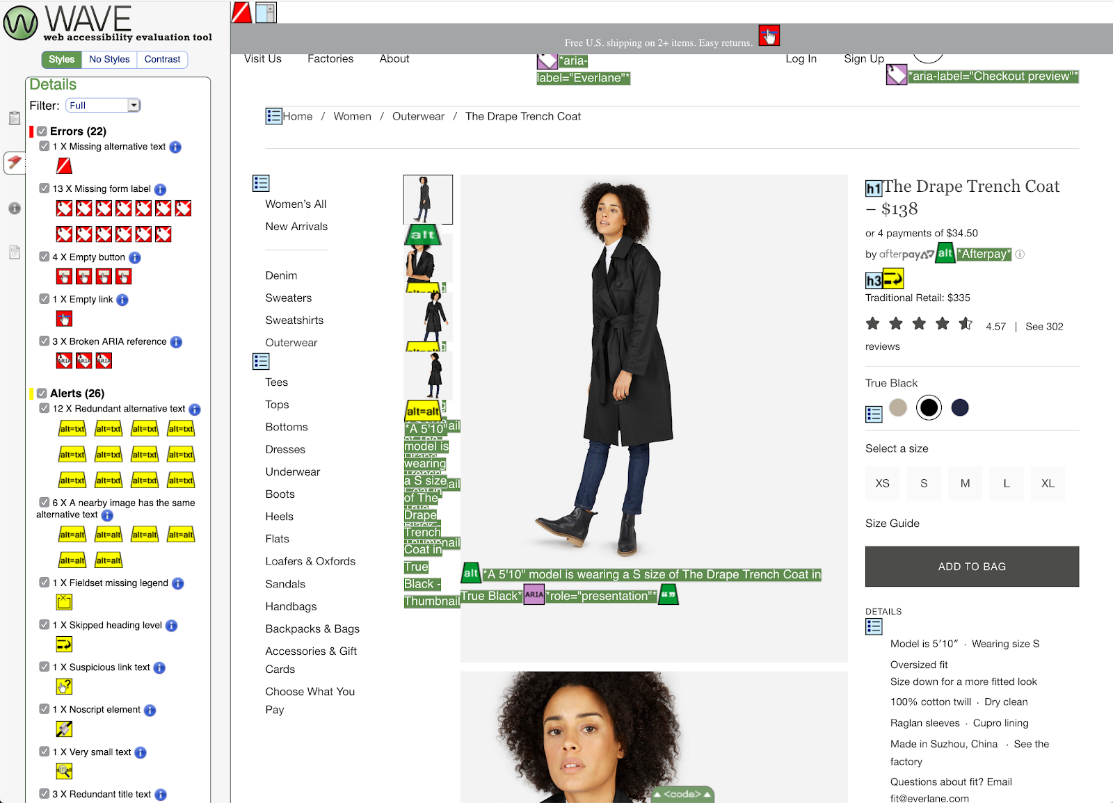
Tag buttons, graphics and images
A lot of users turn to voice assistance to navigate your site. However, for the visually impaired, voice assistance is crucial. Without it, they can’t access any of the necessary information. These users listen to every element on your site, and if you include untagged visual content, they will not know it’s there.
Allow them a chance at interacting with you by tagging your visual content like graphics and images. That can be the difference between a well-informed user and an unsatisfied one. Additionally, ensure that the captions are readable, clear, and concise.
Add turn off features on video and GIF content
Web accessibility encompasses all users. It would be best if you considered your epileptic users who are sensitive to flashing content. The last thing you want is your content triggering a seizure. Users should be able to access your content without worrying about getting an epileptic attack.
A turn off feature can allow users to turn off flashing and moving visual content while surfing the web. The autoplay video feature is also a no go. Let the user decide whether they want to play the video or not.
Create an inclusive user experience
At least 90 percent of users will refrain from going back to a website with poor customer experience. Nothing spells that out more than inaccessible websites. Creating an inclusive design for your website is taking accessibility to the next level. It entails coming up with a universal design that considers all users regardless of race, gender, and age.
Final thoughts
Web accessibility is vital and beneficial to your business. The more your site and content is available, the better chances at improving your conversion rates and driving traffic. Without forgetting the ADA compliance lawsuits, an accessible site is key to staying on the right side of the law.


