The world of digital marketing can be a bit of a paradox.
GDPR tells us to tighten up customer data privacy (a good thing!). But then the European Accessibility Act (EAA) swoops in and mandates accessible digital communication for everyone (also good!).
So, whether you’re a small business or a big enterprise in the EU or selling to the EU, you must know and follow EAA rules.
The good news?
This translates to bigger market opportunities, happier customers (including those with accessibility needs!), and even cost savings for your brand.
Think about your email marketing – the crucial area impacted by this shift.
If your emails aren’t accessible, it’s like shutting the door on a whole group of potential subscribers—recipients who might love your email newsletters but just need a little help seeing them. We all want to be the kind of brand that cares, right? Plus, inaccessible emails just…well, they don’t look good.
But is your brand ready for this biggest email marketing trend of 2024?
This guide is your roadmap to mastering email accessibility! We’ll walk you through everything you need about email accessibility, from best practices to cater to different user needs. We’ll get you sending emails that everyone can enjoy, not just some. Let’s get started!
What is Email Accessibility?
Email accessibility means designing and creating emails so every subscriber, including those with disabilities, can access, understand, and interact with them. Think of it as making public spaces more accessible and friendly for everyone, but in the digital world.
With vision impairments affecting at least 2.2 billion people worldwide (according to the WHO), crafting accessible emails enables you to connect with a broader audience, ensuring everyone can see your messages clearly.
Why Accessible Emails Matter?
Imagine relying on a screen reader and assistive devices to check your email.
People with visual impairments often experience these challenges. Screen readers navigate email content and read it aloud, helping users understand the information.
But what happens when an email isn’t designed with accessibility in mind? It’s like walking into a room full of obstacles. Navigation becomes frustrating and time-consuming.
When you, as the sender, don’t consider email accessibility, it’s like you’re denying users with disabilities a comfortable and inclusive digital environment.
And here’s a thing: accessible emails aren’t just beneficial for people with disabilities. They’re more logical and readable for everyone. In other words, good email accessibility equals good email usability.
By embracing email accessibility, you’re not just sending a message but creating a more inclusive digital environment, which we can all get behind.
But looks like there’s room for all of us to do better when it comes to designing accessible business email templates. If that were not the case, a whopping 99.97% of emails tested by the Email Markup Consortium would not have contained accessibility issues!
This statistic isn’t meant to discourage but to inspire. It’s a reminder that every email you send is an opportunity to make a difference.
So, here are some more reasons why brands, email marketing agencies, and email developers should start taking email accessibility seriously.
- A whole segment of your audience might have visual impairments, learning difficulties, or temporary situations that make traditional emails tricky. Accessible emails break down these barriers, ensuring everyone on your list gets the message – loud and clear!
- If subscribers can’t read or interact with CTAs in your emails, they won’t engage or stay. This hurts your email performance and boosts your unsubscribe rate.
- In 2012, the National Association of the Deaf sued Netflix for not providing closed captions, violating the ADA. Netflix settled in 2013, agreeing to caption all content by 2014. The World Wide Web Consortium (W3C) created the Web Content Accessibility Guidelines (WCAG), the go-to standard for accessibility. Ignoring WCAG can lead to lawsuits and hurt your reputation. Following these guidelines prevents legal risks and keeps your organization’s reputation intact.
- As businesses strive to personalize their messages and connect with their customers’ core values, email accessibility can give you an extra sharp competitive edge.
In essence, creating accessible emails brings many benefits. But first, let’s consider your audience’s diverse needs. Understanding these is key to making emails everyone can enjoy!
Conditions to Consider While Creating Accessible Email Template Designs
| Human Disability Condition | Description | Impact on Users |
| Vision Impairment | Loss of vision, color blindness | Users rely on screen readers and keyboard navigation |
| Motor Disabilities | Difficulty using a mouse (tremors, paralysis) | Users struggle to click buttons and links |
| Cognitive Disorders | Difficulty processing information | Users overwhelmed by complex layouts, too much information |
| Hearing Impairment | Deafness, difficulty understanding speech | Users need captions and transcripts for videos/audio |
| Technical Condition | Description | Impact on Users |
| Email Client Support | Different email clients render code differently | Emails may display incorrectly depending on the client |
| Browsers & Operating Systems | Users have different browsers and OS | Emails may look different across platforms (iOS vs. Android) |
| Devices | Users access emails on desktops, mobiles, tablets | Emails need responsive design for optimal viewing on all devices |
Now, the real question is, how do you make email content accessible to all your recipients?
Top 6 Best Practices for Crafting Accessible Email Campaigns
- Prefer Clear and Descriptive Subject Line
For users with visual impairments who rely on screen readers, a clear subject line is essential. Screen readers announce subject lines and preheaders aloud, so vagueness or excessive length can create confusion.
Here’s how to write subject lines that are accessible and engaging:
- Aim for under 50 characters to ensure full display on all devices.
- Don’t tease or mislead subscribers; use keywords that reflect your email content accurately.
- Stick to one emoji at the end of the subject line. Avoid replacing words with emojis.
Example: “New Arrivals: Summer Styles ☀️”
- Avoid Sending Emails That Are Just Image
All-image emails are like trying to converse with someone speaking a language you don’t understand.
First off, many email clients block images by default. So, if your email is all pictures, some people won’t see anything when they open it.
Plus, screen readers can’t interpret the content within images. This means that users who rely on screen readers will miss out on your entire message if it’s presented only in image format.
The solution?
Focus on text-based emails! The most common recommendation is to aim for an 80/20 text-to-image ratio. Craft clear, informative content that stands on its own, even without images. You can still include visuals to enhance your message but prioritize text for email accessibility and deliverability.

Image Source: Litmus
Also, if your message is buried in an infographic, visually impaired users might miss it entirely. Hence, always present the most critical content in the text. Use images to complement that text, not replace it.
Lastly, if you include videos, make them accessible too! Offer transcripts for viewers with hearing impairments, allowing them to enjoy your video content as well.
- Simplify Your Email Layout for Accessibility
A simple email layout is crucial for reducing sensory overload, especially for users with disabilities. Too many images, tables, columns, and links can overwhelm the reader. To make your emails more accessible, stick to a single-column layout. This makes content and functionality easier to locate and identify, especially for mobile users.
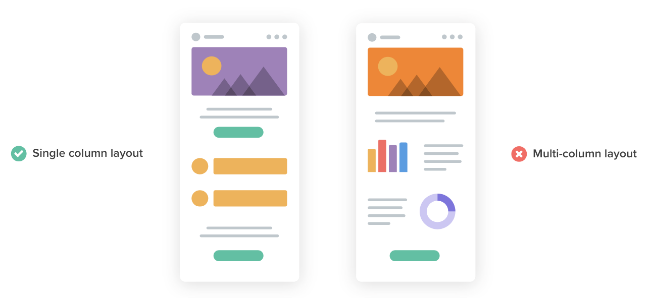
Image Source: Litmus
When creating emails, opt for HTML format. HTML is the way to go for the most accessible experience. Here’s why:
- HTML lets you organize content with headings, paragraphs, lists, and tables. This structure makes it a breeze for adaptive technologies to navigate.
- HTML supports different text styles, such as headings, bold, and italics, which help convey meaning and are especially helpful for people with visual impairments.
Also, steer clear of bunched-up text. Even if your email is long, it’s okay if it’s well-formatted. Break your text into smaller paragraphs and use headers and bullet points to make it easier to read. This helps screen readers and makes it more engaging, especially on smaller screens.
- Ensure High Color Contrast for Readability
Let’s talk color contrast. It’s key for making your emails accessible, especially for those with color blindness. You don’t have to go with just black and white, but make sure your text stands out against the background.

Here’s how to nail email accessibility with color contrast:
- Aim for a contrast ratio of at least 4.5:1 for standard text and 3:1 for larger or bold text.
- Check your colors with tools like WebAIM’s Color Contrast Checker to ensure they meet accessibility standards.
- Stick to one text color and one contrasting background color. Avoid bright, saturated colors for text.
- Use headers, bold text, or other visual cues to highlight important info, not just color.
- Use tools like Inbox Preview to see how your email looks in different clients and with color blindness filters.
- Use Legible Typography
The right fonts, sizes, and spacing can make or break your email accessibility and readability. Here’s how to ensure everyone can easily read your emails:
- Fonts like Arial, Calibri, or Verdana are smooth and easy to read. Avoid serif fonts like Times New Roman with little hooks that can be hard for some to decipher.
- Maintain a balance between lines—too close makes it hard to distinguish, while too far apart creates disjointed reading. Aim for 1.5 to 2 spacing, as recommended by the World Wide Web Consortium, for improved readability.
- Use a font size that’s readable on all screens. Typically, 18px for headlines and 16px for body text works well.
- Increase font size for emphasis instead of using all caps, which can be hard to read.
- Ensure there’s enough space between lines and paragraphs. Line height should be around 4 pixels to prevent text from looking cramped.
- Stay away from overly decorative fonts, drop caps, and text effects. Keep it simple and clear.
- Only italicize when necessary, as it can be hard to read if overused.
Still wonder how easy it is for people to read your emails? Well, readability tests are here to help.
One of the most popular tests is the Flesch Reading Ease test. It looks at the average length of sentences and words to rank your email on a scale from 0 to 100. The higher the number, the easier it is to read your email copy. Aim for a score of 60-70. That’s the sweet spot for plain English that everyone can understand.
- Give Proper Alt Text to Images
Alt text is essential for making your emails accessible. It’s a short description of an image that helps people who can’t see the image understand its content.
Here’s how to use Alt Text for email accessibility:
- Keep it short, but make sure it describes the image and its relevance to your message.
- Don’t start with “image of” or “photo of” – screen readers will announce it’s an image.
- If the image has a caption, ensure the alt text provides additional information rather than repeating the caption.
- Add alt text only to informative images. For purely decorative images, set the alt attribute to an empty value (alt=””) to inform screen readers they can be ignored. You can also label these as “Decorative” in the alt text properties field.
- Avoid using GIFs and animations, as they can create significant accessibility barriers for some users.
Wrapping Up
Email offers a powerful way to connect with vast audiences. But true connection hinges on inclusivity, ensuring everyone feels welcome, especially those with visual impairments.
While mastering email accessibility takes time, even basic improvements put you ahead of the curve. The tips in this blog provide a springboard to build a foundation for more accessible email campaigns.
Sure, it’ll take some time and effort, but making your emails more customer-focused and inclusive is worth it. It improves the experience for all your subscribers and shows you value everyone on your email list.
 (3 votes, average: 5.00 out of 5)