As email marketers, when you sit down to design an email campaign, what’s your ultimate goal? For it to reach as many people as possible, right? Well, there’s only one surefire way of ensuring that- practicing accessible email design. It doesn’t matter how riveting your copy is and how attractive your design, your emails will never fetch the returns you want them to unless they are accessible, to begin with.
But, email accessibility isn’t just about enhancing your visibility and expanding your reach; it’s more about fostering inclusivity. More than 1 billion people are estimated to be living with a disability at present. The number of people leading their lives with some level of visual impairment amounts to approximately 2.2 billion. The aim of email accessibility, thus, is to foster a comfortable online environment for this demographic. Your emails must be comprehensible for all kinds of people, irrespective of their disabilities or the assistive tools they might be using.
In this article, we walk you through a few practices that will power you to craft accessible email campaigns moving forward. Read on to find out!
Be Judicious With Color
Color is a core part of email design and shapes your brand identity. Hence, you need to ensure that the color combination you pick for your campaigns is suitable for a broad spectrum of users. Individuals who are color blind or suffering from some form of visual impairment experience trouble processing certain shades; try to avoid using them in your campaigns. Even if you have to use them, make sure that color isn’t the only element conveying information in your emails. Another factor you need to be mindful of, besides the color palette, is the contrast ratio. When the color of your text is similar to that of your background, users will have a tough time distinguishing them. Subsequently, this will spoil their user experience. Maintaining a high contrast between your background and foreground elements (be it text, a clickable link, or the call-to-action button) goes a long way towards enhancing readability. If you face trouble determining the color contrast manually, consider using any of the multiple contrast checker tools available online.
Optimize Your Emails For Screen Readers
People suffering from visual impairments or other cognitive disabilities use screen readers to consume emails. Thus, optimizing your emails for screen readers is an essential design accessibility practice. At the outset, keep in mind that screen readers don’t parse through information in the same manner as we do. Unlike us, they can’t voluntarily determine and jump to the most critical segment of the email; screen readers process emails in a linear fashion. Here are some tips you can keep in mind to make your emails screen-reader-friendly.
- Include skip navigation links in your emails. This will enable users to navigate directly to the email’s most important section.
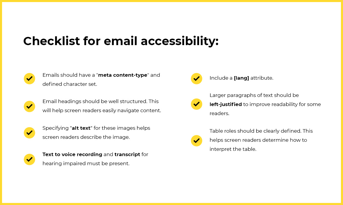
- Use the “lang” attribute. Without this attribute, the email gets interpreted in the default language the user specified for the screen reader at the time of installing it. As a result, emails written in a different language might not get conveyed accurately to the users.
- Use semantic HTML markup in your emails. This lets you define the meaning of each and every element of your email. With these tags you can alert the screen reader to headings, paragraphs, and even the presence of clickable buttons. Since semantic elements provide additional context to the screen readers, email navigation becomes much smoother.
- Write descriptive alt texts. Since screen readers rely on them to communicate images to their users they need to be written with as much clarity as possible. Ensure that your alt texts assist readers to properly envision the visual elements in your emails.
Avoid Using Too Many Images
Sure, images do liven up your emails but when used in excess they can ruin the user experience. Firstly, people using screen readers won’t be able to engage with your images at all; they will interpret it via the alt texts. Secondly, failure to maintain the right balance of text and images in your emails will get you on the wrong side of spam filters. Typically, a ratio of 80% text and 20% images is considered ideal. So, use images only to complement your email copy and the overall design aesthetic of your template; not to communicate any vital message.
Make Your Content Easy To Consume
Now, this comprises many things. We’ll start with font. Remember, your emails have to be readable for both desktop as well as mobile users, so picking the right font size is absolutely crucial. Most reckon 14-16px to be the ideal range. Font-weight, or the thickness of your font is another important factor that influences readability. As many as 78% of readers prefer fonts with a mid-rang thickness. When it comes to the typeface, there are broadly two options that brands contend with- serif, and sans serif. To avoid rendering issues, stick to composing your emails with web safe fonts only.
The most common web safe fonts are:
- Arial
- Times New Roman
- Georgia
- Courier
- Verdana
Next, let’s address structure. Rather than presenting your content in long paragraphs, attempt to break it down into multiple subheadings. This will make the navigation significantly more convenient for your readers. Also, don’t be stingy with spacing. You must let your email copy breathe. Going through blocks of text where the lines are glued to one another can, and will, put off your subscribers. Ensure there’s enough spacing between two consecutive lines and successive paragraphs.
Lastly, alignment. Don’t “justify” your copy. If there’s inconsistent word-spacing, justifying your text can make it a nightmare for readers to go through your email. Normally, left-aligning the text is considered to be the best course of action.
If you’re new to email accessibility, keep this email accessibility checklist handy.
Wrapping It Up
In the current scheme of things, brands are expected to foster an inclusive environment as much as any other member of our societies. Email accessibility lets them take a step in that direction. Additionally, it also boosts their reach and allows them to steer clear of legal issues. All of these factors eventually come together to give them a competitive edge over their competitors. Want to dive deeper into email accessibility, go through this ultimate guide co-created by Email Uplers in collaboration with GetResponse.

 (No Ratings Yet)