
Your landing page is an essential piece of the marketing puzzle. When potential customers arrive at a landing page you set up, they instantly form an opinion about your business. Their ability to navigate and understand your landing pages can greatly impact your conversion rate.
That means your landing page needs to be simple yet effective. It should be easy to understand and appeal to your entire target audience regardless of any disabilities they may have.
In other words, it needs to be accessible.
Why does a landing page need to be accessible? For starters, you want to cast the widest net possible. You don’t want to leave anyone out of your potential pool of customers. Additionally, there are specific accessibility laws and mandates that you must meet to keep your site compliant and avoid penalties.
You can achieve accessibility by effectively using visual elements on the page. In this article, we’ll walk you through how to use visual elements on your page to adhere to accessibility requirements and boost landing page conversions.
What do we mean by visual elements?
When we say visual elements, the first thing that likely comes to mind are images and infographics. While these are absolutely examples of effective visual elements that can improve accessibility, they’re by no means the only examples. There are many different visual content types.
Visual elements include your:
- Header
- Menu
- Font
- Color scheme
- CTA buttons
- Layout
- Designs
- And more
Before moving on, we should note that visual elements aren’t the only way to improve accessibility on a landing site.
In fact, it’s imperative to use a text-to-speech service to enhance the user experience. It enables people with visual impairments or screen readers to access landing page content effectively.
By turning written text into audio, the text-to-speech service makes information accessible to everyone. Users can listen to the content instead of reading it visually.
Now, let’s get on to the heart of the matter.
How can visual elements impact landing page accessibility?
With a versatile landing page full of engaging visual elements, you’re sure to impress your leads and move them through your sales funnel. But don’t stop there.
The goal is conversion, right? So take your content assets and use them strategically with your landing page to make your offer irresistible.
We’re talking about content curation. Consider things like:
- Using a how-to video on your landing page to give your prospects a head start with your SaaS solution
- Showcase an infographic that consolidates the high points of your latest blog post
- Share social proof, testimonials, and reviews from social media raving about your product
In the following sections, we’ll review several landing page examples and showcase how they effectively use visual elements (curated content) to improve accessibility.
BriteCo
BriteCo’s commitment to accessibility goes beyond aesthetics. Its landing page is designed with user experience in mind, guaranteeing that everyone can comfortably navigate and engage with the content.
It uses large, legible fonts coupled with high-contrast colors to enhance readability for those with visual impairments.

As seen above, the placement of prominent call-to-action buttons allows users to take desired actions without confusion.
Clear and concise headings guide users through each section of the page. That makes sure they can quickly find the relevant details about their engagement ring insurance or jewelry coverage.
Another excellent approach to adding visual appeal and breaking up text-heavy content effectively is using infographics. Not only that, but they also serve as a potent SEO tool, enabling your page to rank higher for specific keywords in both text and image searches.
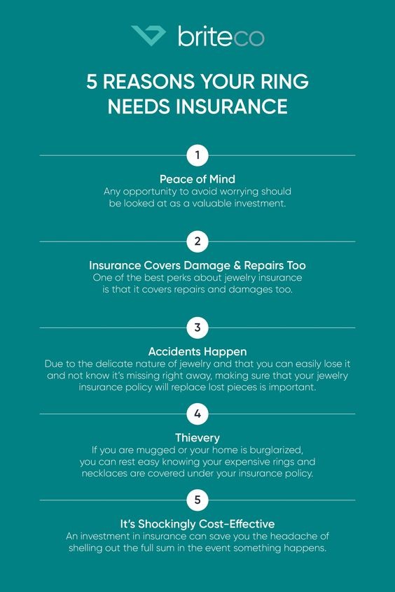
By prioritizing accessibility without compromising on aesthetics, BriteCo successfully creates an inclusive experience for all website visitors interested in jewelry insurance.
StudioSuits
StudioSuits’ landing page stands out as an exemplary example that effectively uses visual elements to impact positive accessibility. With a focus on providing tailored suits for customers, StudioSuits goes above and beyond to provide a visually engaging and inclusive browsing experience.
Let’s delve into what sets StudioSuits’ landing page visuals apart and how it contributes to enhanced accessibility.
StudioSuits demonstrates a commitment to inclusivity by providing descriptive alt text for all images on its landing page. This practice guarantees that users relying on screen readers receive accurate and meaningful descriptions of visual content.
By including informative alt text, StudioSuits allows individuals with visual impairments to fully comprehend and engage with the imagery, creating an inclusive browsing experience.

This landing page showcases a streamlined and intuitive layout that enhances accessibility. The design incorporates logical information grouping, clear headings, and well-organized sections. This thoughtful arrangement enables users with cognitive disabilities or screen readers to navigate the content seamlessly, providing a user-friendly experience for all visitors.
You’ll note in the image above that each section shows both a text description of the link’s destination and a visual aid. For example, one button says “Green Suits” while also showing a photo of a green suit. This addition makes the content more accessible to someone struggling to read English.
Clear Origin
Clean Origin’s Ethical Jewelry page is an exemplary landing page model that effectively applies visual elements to promote accessibility.
Not only does Clean Origin showcase its exquisite diamond tennis bracelets and other jewelry. It goes the extra mile to create a user-friendly experience for all visitors.
Let’s explore how Clean Origin leverages visual elements to enhance accessibility and what sets its landing page visuals apart.

Clean Origin understands the importance of providing clear, detailed visuals of its ethical diamond tennis bracelets and other jewelry pieces. By featuring high-resolution images, users can get a comprehensive view of the products. That allows those with visual impairments to understand the designs and make informed choices.
The imagery above carefully captures the intricate details, cuts, and settings. That enhances overall accessibility and provides a captivating browsing experience.
This page also considers the importance of color contrast and readability for users with visual impairments.
The landing page employs a visually pleasing color palette that enhances the aesthetic appeal and guarantees that the text stands out against the background. This deliberate choice helps users with low vision or color blindness read the content effortlessly, fostering an inclusive environment.
Hers
Hers’ Minoxidil for Women landing page is notable for its exceptional use of visual elements. It creates improved accessibility and a comfortable browsing experience for website visitors.
With a focus on addressing hair loss in women, Hers implements design techniques that prioritize inclusivity and user comfort. Let’s explore what makes Hers’ landing page visually special and how it contributes to a comfortable user experience.

Hers understands the significance of providing clear and engaging visuals to convey its product’s purpose effectively. The landing page features high-quality images that showcase the product, Minoxidil. It also displays before and after photos and customer reviews which serve as excellent social proof.
These visuals capture the attention of visitors to your website and help them understand the product’s potential benefits. By offering a visually engaging experience, Hers creates a sense of comfort and engagement.
Hers prioritizes accessible typography and font sizes, promoting comfortable reading for all users. The choice of font and size allows for effortless reading without causing eye strain or the need for constant zooming.
By implementing readable typography, Hers makes sure that visitors can comfortably consume the content without experiencing visual discomfort.
Termly
In the realm of web design, providing accessibility isn’t just a moral imperative but also a legal requirement.
One notable example of a landing page that effectively incorporates visual elements to impact accessibility is Termly’s free Privacy Policy Generator page. Let’s explore why this page stands out as an excellent model for enhancing accessibility through its visual elements.

Termly’s landing page employs a visually striking and easy-to-navigate design, allowing users with diverse abilities to find the information they need effortlessly. The layout features a concise and well-structured menu, using contrasting colors and clear typography to guarantee optimal readability.
In the image above, you’ll note that the elements on the left side of the page are in individual boxes. Each box has a header and contrasting color body text in a list format for easy skimming.
This design choice aids users with visual impairments or cognitive challenges in quickly understanding and navigating the page.
Termly’s Privacy Policy Generator page effectively employs visual elements to enhance accessibility.
The inclusion of relevant and descriptive images helps convey information and aids individuals with cognitive disabilities in understanding the content more easily.
Concise and informative alt text complement the visuals, allowing screen readers to provide accurate descriptions to visually impaired users.
Accessibility extends beyond visual elements to encompass responsive design. Termly’s landing page excels in this aspect.
The page adapts seamlessly to different screen sizes and devices. That guarantees users with various devices or screen readers can easily access and navigate the content.
Conclusion
And there you have it. Five quality examples showcasing how you can take the visual elements of your landing page and use them to meet accessibility standards.
To review, a visual element can be more than just an image or infographic. It encompasses anything from your typeface to the color scheme of the site.
In the examples listed above, we saw several ways visual elements can aid accessibility.
These included:
- Intuitive design elements
- Alt text applied to images
- Responsive designs that can meet any screen size
- Contrasting colors to make text pop
- Descriptive imagery
- Call to action buttons on display to make for easy conversions
By implementing some of these visual elements into your landing pages, you’ll create a far more effective and accessible experience. The result will be happier customers, higher traffic levels, and more conversions than ever before.
 (1 votes, average: 5.00 out of 5)