

Content shapes how people learn about a problem, compare their options, and decide what to do next. Every piece of content gives potential customers another reason to stay engaged or move on. That’s why publishing content without a clear purpose often leads to missed opportunities, even when the quality is high.
A strong content strategy supports every stage of the customer journey. It answers early questions, builds trust with useful information, and gives people the confidence to make informed decisions. Each piece has a specific job, whether that’s introducing your brand, explaining a solution, or helping someone choose between alternatives.
When your content aligns with what people need at each stage, it creates a smoother path from discovery to decision.
In this article, you’ll learn how to match content formats, topics, and messaging to every step of the journey so your marketing delivers consistent value and measurable results.
Turn Product Content Into Purchase Confidence
Unfamiliar products create hesitation. A shopper facing dozens of options, technical specs, or an entirely new category often stalls out and leaves without buying.
Buying guides, product education, recommendation tools, and side-by-side comparisons remove that friction. They break down what a product does, who it fits, and how it compares, giving shoppers the context they need to choose without second-guessing themselves.
This kind of content does more for your business than it might seem. When customers understand what they’re buying and why it suits them, they use the product correctly, get better results, and stay loyal longer. Educational content sets customers up to succeed, and that success shows up directly in retention, reviews, and referrals.
How to implement this:
- Map every question a customer asks before checkout. Pull these from support tickets, sales calls, and search queries related to your products.
- Turn each question into its own guide or FAQ entry, written in plain language.
- Build comparison pages for products customers often confuse or weigh against each other. List specs side by side, then add a short recommendation for each use case. Avoid vague claims like “great for everyone.”
- Add a quiz or recommendation tool if your catalog has range. Ask three to five questions about the customer’s needs, then match them to specific products. Keep it short, though. Long quizzes lose people halfway through.
- Pair every product page with a short explainer video or diagram showing the product in use. Visuals answer questions plain text alone often can’t.
A neat example that shows how it’s done is Scentbird, a fragrance subscription service.
The company teaches customers about fragrance families and scent notes through its blog and guides. Then, they use a short quiz and subscription-based sampling to help people pick a scent with less risk than a blind purchase.
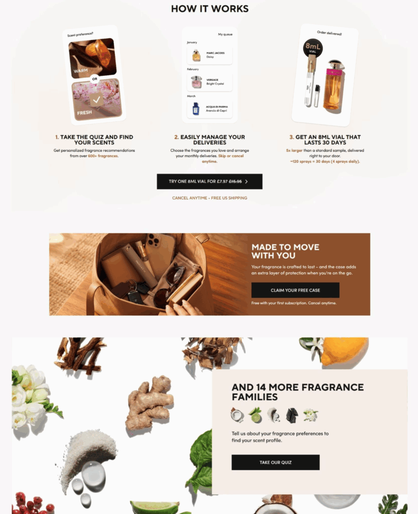
Source: scentbird.com
Anticipate Buyer Questions Before They Become Obstacles
Uncertainty stops buyers cold. A shopper who can’t find a clear answer about ingredients, usage, or how one product differs from another often abandons the decision entirely rather than keep searching.
FAQs, comparison pages, ingredient explanations, and usage guides close that gap. They answer the questions people ask right before they’d otherwise leave, keeping the buyer moving instead of stalling out.
Successful businesses treat these questions as a roadmap, not an afterthought. Every recurring question points to a piece of missing content. Publish the answer before the question becomes a reason to walk away, and you remove doubt at the exact moment it forms.
How to implement this:
- Pull your most common customer service questions from the past six months. Group them by theme, like ingredients, usage, safety, comparisons, and results. Each theme becomes a content cluster on your site.
- Write a detailed FAQ page that goes beyond one-line answers. Explain the reasoning behind each answer, not just the answer itself. A question about dosage deserves context on why that dosage works, not just a number.
- Create comparison content for any two products customers frequently mix up. Lay out the differences in plain terms – ingredients, price, use case, and results customers can expect.
- Build an ingredient glossary if your product involves components customers won’t recognize. Link to it from every product page so people can look things up without leaving your site.
- Update these resources regularly as new customer questions keep coming in through your support channels over time.
Performance Lab, a nutritional supplements brand, applies this well.
The company explains product benefits, ingredients, and correct usage in detail. They also break down the differences between similar supplements so customers can pick the right one with confidence instead of guesswork.
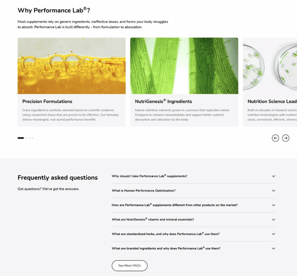
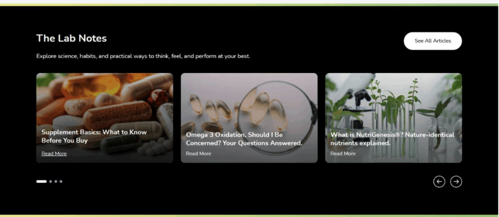
Source: performancelab.com
Use Evidence and Trust Signals to Remove Decision-Stage Doubts
Sensitive or high-stakes decisions demand more proof before someone commits.
Medical choices, legal matters, and major financial decisions all carry real consequences, and readers researching them look for expert-reviewed information, credentials, authoritative sources, and firsthand accounts from people who’ve faced the same situation. Reviews and transparent evidence give readers a way to check that what they’re reading holds up.
Websites that hide their sources, skip explaining how they select information, or obscure who runs the site lose trust fast. Readers researching consequential topics notice these flaws quickly, and they leave for sites that show their work.
How to implement this:
- Add author bylines with real credentials to every piece of content that touches sensitive topics. If a nurse, lawyer, or specialist personally reviewed the content, say so and link to their background.
- Cite your sources directly within the content itself, not just in a general disclaimer at the bottom. Link to studies, government data, or professional organizations wherever you reference a fact.
- Publish a clear editorial process page explaining how you research, fact-check, and update your content. State clearly who owns the site and what their interest is in the topic.
- Include real experiences from people who’ve gone through the situation your content addresses, alongside the expert information. Personal accounts and professional guidance work far better together than either one alone ever could.
- Update older content when new information becomes available, and note the date of the last review at the top of the page.
A good example here is Mesothelioma.net, a resource offering free information and support for people diagnosed with mesothelioma.
The site combines treatment information, specialist guidance, survivor accounts, and legal resources. It also fact-checks its content and lists its sources, giving patients and families a dependable place to find answers.
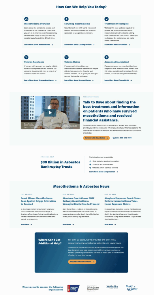
Source: mesothelioma.net
Guide Buyers from Discovery to Decision Across Every Channel
Buyers move across channels without thinking about it. They see a social post, visit the website, get an email, then check reviews before buying. If the messaging shifts or contradicts itself along the way, they hesitate and question whether they’re dealing with the same brand at all.
Connected messaging keeps the story consistent, so each new touchpoint builds on the last instead of starting the buyer over.
This isn’t a minor preference. Roughly 87% of consumers say it matters for a brand to feel consistent across every touchpoint, from social media to the website to customer service. Inconsistency reads as unreliability, even when the product itself is solid.
How to implement this:
- Document your brand voice, key messages, and visual identity guidelines in one shared reference. Every team member creating content, from social posts to email replies, should pull from the same shared document.
- Map your customer’s likely path across different channels – social discovery, website visit, email follow-up, and final purchase decision.
- Check that each stage reflects the same offer, the same tone, and the same core value proposition.
- Connect your marketing tools so customer data flows between them without gaps. A customer who takes a quiz on your site shouldn’t get generic emails afterward. The recommendation should carry through to their inbox, their retargeting ads, and their next visit to the site.
- Train your customer service team on your current campaigns and promotions so their answers match what customers already saw in your recent ads and social posts.
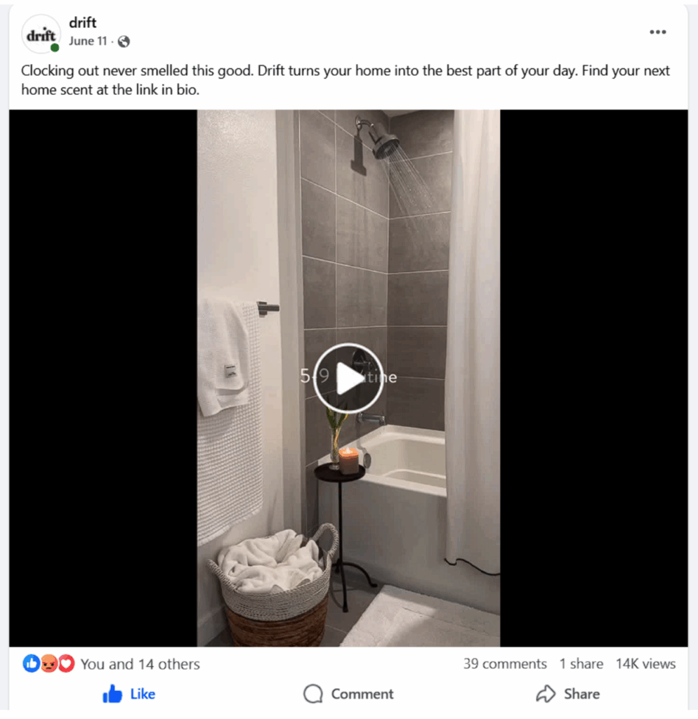
Drift, a car and home air freshener brand, follows this approach.
The company draws people in with engaging social media posts, then continues the journey on its website, where a scent quiz personalizes the shopping experience and makes the decision feel simple and connected.
Source: facebook.com

Source: drift.co
Address High-Stakes Concerns Before Buyers Decide
Hiring a lawyer, a financial advisor, or any professional whose decisions carry real weight comes loaded with worry. Clients wonder about cost, outcomes, and whether they can trust the person handling their case.
Content that addresses these concerns directly, before a prospective client ever picks up the phone, does more to build confidence than any headline promising results.
How to implement this:
- Cover cost first, since it’s the question people hesitate to ask out loud. Explain your fee structure in plain terms. Focus on hourly rates, flat fees, or contingency arrangements, and what triggers each cost along the way.
- Write detailed content that walks through what a typical case or engagement looks like from start to finish, step by step. People fear the unknown more than they fear a difficult process, so a clear timeline reduces anxiety even when the news isn’t all good.
- Publish a guide on how to choose a professional in your field. List the questions clients should ask, the credentials that matter, and the red flags to watch for. This positions you as an authority instead of a salesperson, since you’re helping people evaluate the whole field, not just your firm.
- Explain client rights clearly and in full. What can they expect in terms of ongoing communication? What control do they keep over major decisions? Spell it out so nothing feels hidden.
- Address worst-case scenarios honestly instead of avoiding them entirely. Clients trust professionals who explain real risk rather than promise guaranteed outcomes.
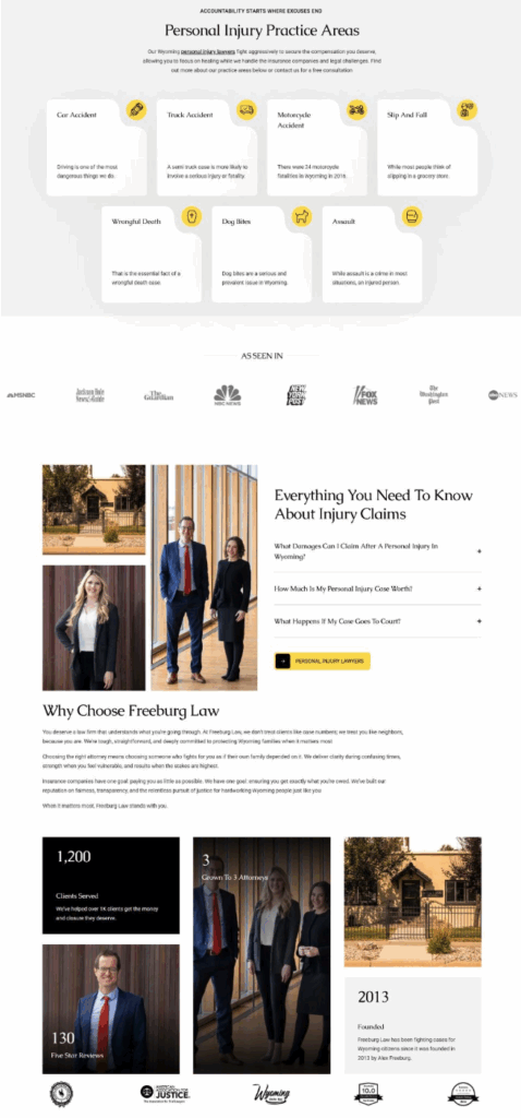
Freeburg Law, a Jackson Hole personal injury and criminal defense attorney firm, demonstrates this principle effectively.
The firm uses content that explains how to pick the right attorney, what rights clients hold throughout a case, and what to expect from legal action, helping prospective clients evaluate their options before booking a consultation.
Source: tetonattorney.com
Use Case Studies to Prove Real Results Before Buyers Commit
Claims are cheap. Anyone can say their product works, but a buyer weighing a purchase wants proof from someone who’s already taken the risk.
Case studies fill that void. They show a real customer’s starting point, the challenge they faced, and the measurable outcome after using your product, turning an abstract promise into evidence a buyer can actually check.
How to implement this:
- Start each case study with a specific, relatable problem. Skip generic openers like “Company X needed to grow.” Name the actual obstacle, such as slow checkout times, low email open rates, or missed appointments. Buyers recognize their own situation faster when the problem is concrete.
- Lead with the numbers. State the result in the first few lines, not buried at the end. A 40% drop in cart abandonment or three extra hours saved per week gives readers a reason to keep reading immediately.
- Include a direct quote from the customer, since a real voice carries more weight than your own summary of their experience. Keep it short and specific rather than a vague compliment.
- Match case studies to buyer segments. A small retailer and an enterprise client care about different outcomes, so build a small library that lets each visitor find a story close to their own situation.
- Place case study highlights on high-traffic pages, not just a buried case studies tab. Your homepage and pricing page both benefit from a quick proof point linking to the full story.
SnapLogic, an intelligent integration platform that helps enterprises connect applications and automate business processes, masters this practice.
Its homepage features excerpts from customer case studies, each showing the specific challenge a client faced and the key metrics they achieved, with a link to the full story for readers who want the complete picture and more.

Source: snaplogic.com
Use Strategic Internal Links to Keep Buyers Moving
A single article rarely answers everything a reader needs. Someone researching one topic usually has three or four related questions sitting right behind it, and if your content doesn’t point them toward the next answer, they’ll open a search bar and find it somewhere else.
Strategic internal links keep readers inside your site, moving from one useful page to the next instead of bouncing after a single visit.
How to implement this:
- Map your content into clusters built around a central topic, often called a pillar. Each cluster should have one comprehensive guide at its center, surrounded by shorter pieces that cover specific subtopics in depth.
- Link from every subtopic page back to the pillar page, and link from the pillar page out to each relevant subtopic. This structure helps readers navigate naturally and helps search engines understand how your content connects.
- Add links at the exact moment a reader might have a follow-up question, not just in a generic “related articles” list at the bottom. If you mention a term or process that deserves its own explanation, link to it right there in the sentence.
- Use clear, descriptive link text instead of generic phrases like “click here.” Tell the reader exactly what they’ll find, so they can decide if it’s relevant to them.
- Review your older content regularly and add links to newer pieces as you publish them. A content library only works as a moving system if you keep connecting it.
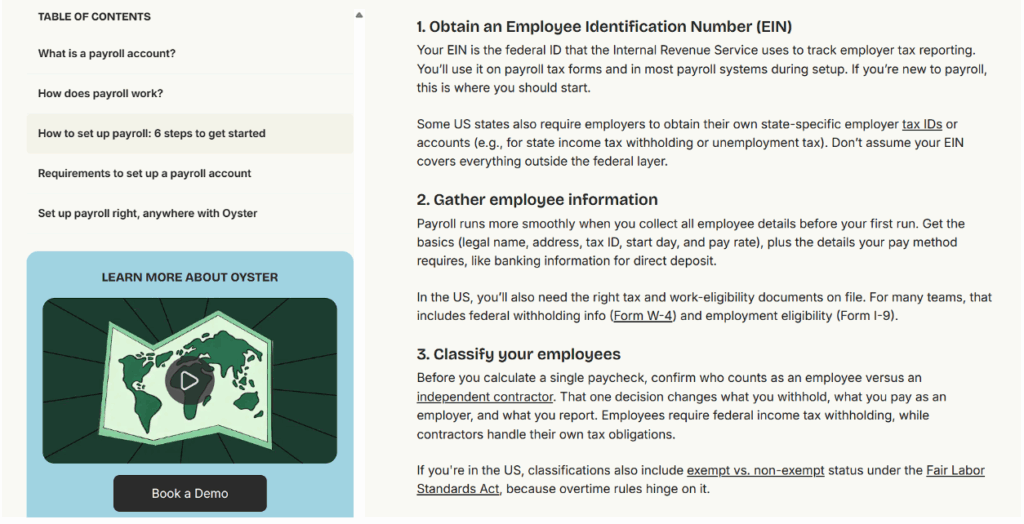
Oyster, a platform that helps companies hire, pay, and manage talent across borders, excels at this connective strategy.
Its guide on setting up a payroll account links out to related topics throughout Oyster’s blog, supporting an entire content pillar that keeps readers moving instead of reading once and closing the tab.
Source: oysterhr.com
Turn Buyer Intent Into Action with Effective Calls to Action
A visitor can read every word on your site, agree with all of it, and still leave without taking the next step. That space between interest and action is where good content earns its keep.
A clear CTA tells someone exactly what to do next, and when it’s placed and worded well, it turns a passive reader into an active buyer.
How to implement this:
- Write CTAs that describe the action, not a vague benefit. “Download your template” tells someone precisely what happens the moment they click. “Unlock your potential” tells them nothing.
- Match your CTA wording to where the reader currently stands in their buying journey. Someone reading a blog post isn’t ready for “Buy now” quite yet. Offer something lower-commitment, like an interactive quiz or a free trial, and save the direct sales language for product and pricing pages.
- Place your primary CTA where readers naturally land their eyes first, typically near the top of the page, and again after you’ve made your full case. Don’t bury it at the bottom where only the most determined readers will ever scroll to find it.
- Use color and visual contrast deliberately. Your CTA button should stand out clearly from the surrounding page, ideally in your brand’s accent color against a clean background, so it’s the first thing a reader’s eye catches.
- Readers scan buttons quickly. They don’t read them closely. So keep the button text short and punchy. Two to four words work better than a full sentence.
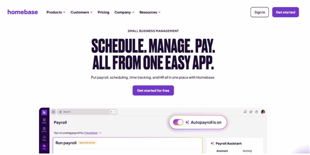
Homebase, an all-in-one team and workforce management platform, demonstrates CTA clarity with precision.
Its homepage states its value proposition clearly, then follows with a centrally placed CTA in the brand’s accent color set against a white background, reading “Get started for free” to drive immediate action.
Source: joinhomebase.com
Final Thoughts
Content works best when it treats a buyer’s journey as a series of connected moments rather than a single push toward checkout.
Each tactic covered here addresses a different point of hesitation along the way. Together, they turn a scattered collection of content into a system that answers questions before they become obstacles and builds trust before a buyer asks for it.
The brands that get this right don’t rely on one standout piece of content. They build a network of resources that hands readers off from one useful answer to the next, until the decision feels obvious rather than forced.
So, start with the stage where your audience drops off most, apply the right tactic there, and expand from that point outward.
 (1 votes, average: 5.00 out of 5)
 Loading...