How to create an engaging newsletter: Easy steps to get started
There’s no place like the email inbox. Compared to the noise of social media feeds, it lets you create a one-on-one conversation with your ideal reader and customer.
Data from 2019 shows that you can expect an average return of $42 for every $1 you spend. That opportunity is too good to miss, and businesses of all sizes know it.
According to the report from Emarsys, 81% of SMBs rely on email as their primary customer acquisition channel, and 80% for retention. Email is a valuable tool across the whole customer journey.
Chances are you already knew this. You already want to build an engaging email newsletter, but you didn’t know where to start. If that’s you, you’re in the right place. In this guide, we’re sharing easy and practical tips to create a newsletter that brings joy to your audience’s inboxes, and brings you results you want.
Step 1: Choose your email newsletter format and set a goal
Your newsletter can be anything you want—which is a blessing and a curse. You can use it to share:
- Your blog posts, videos, and other original content
- Product updates
- Promotions and discounts
- Press coverage
- Curated content
It can be tempting to share whatever feels right each time you want to email your subscribers. But to get them into a habit of opening and reading your newsletter, focus on creating a format they can expect each time.
A great way to do this is to create sections for your newsletter and fill them out with relevant content each time.
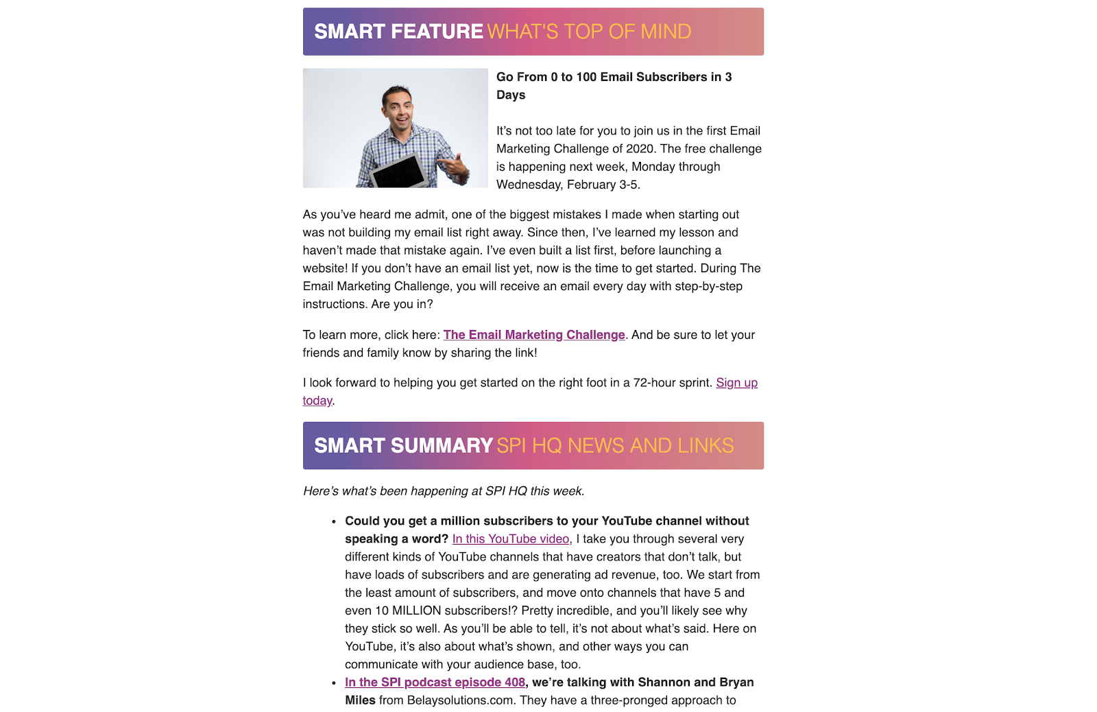
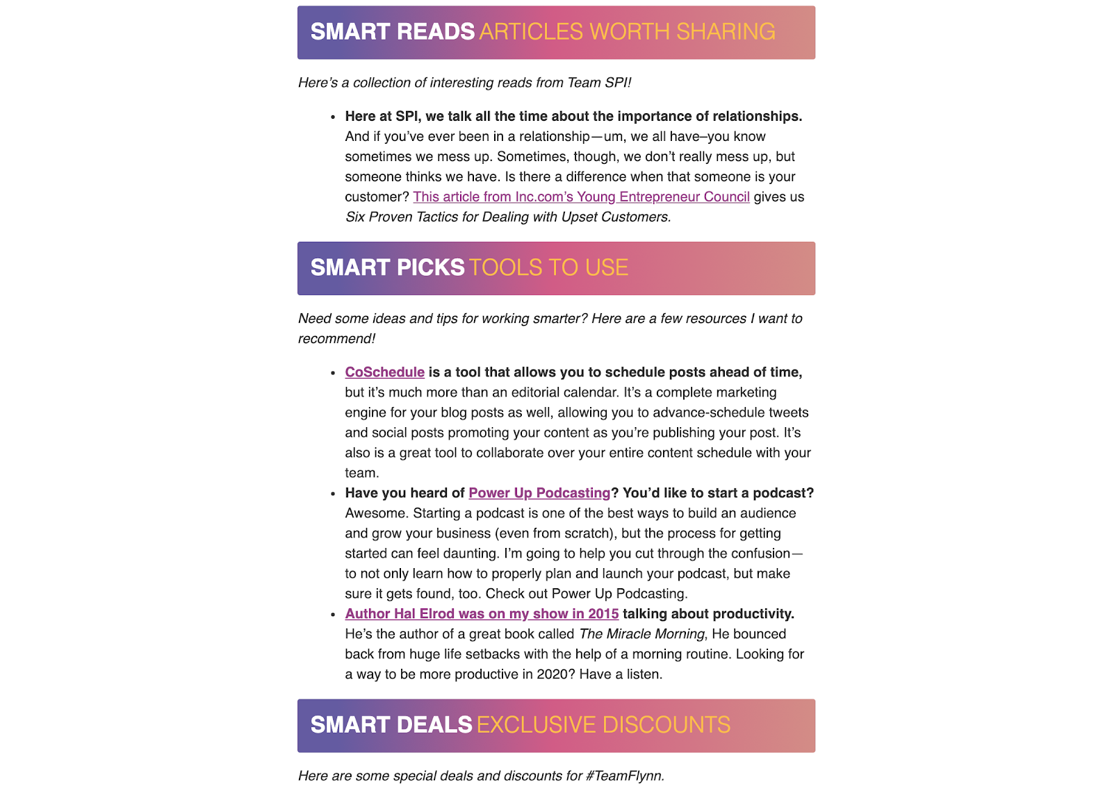
Here’s a great example from Pat Flynn of Smart Passive Income.
At the top of his email, he writes a few paragraphs from him directly to the reader. Then, he adds several sections with valuable resources.
Here are the first two sections of one of his recent emails:
And here’s the second half:
As you can see, he shares a mix of his own content (a free challenge, a YouTube video, and a podcast episode) and third-party content (article from Inc.com, a marketing tool recommendation).
The takeaway here is to focus on how these resources all work together in the same email. If you share a dozen links that have nothing to do with each other, you’ll confuse your subscriber.
But choosing resources that easily connect to each other, sorted into categories and sections, is key: you’re showing your reader you’ve combed through the internet for them and you’re sharing the best of the best.
How do you choose which resources will make it to each section? The answer is by setting your newsletter goals.
Here are some common email newsletter goals to inspire you:
- Drive traffic to a landing page
- Promote a blog post series
- Promote a new or updated product or service
- Drive event attendance
- Drive whitepaper downloads
Each time you’re creating a new edition of your newsletter, have a goal in mind. This will help you select the best resources, choose the best placement in your email for them, and pick the right call to action (we’ll cover that later in this guide).
For example, Pat Flynn’s main goal for the above email was to drive signups for his free challenge. It got the biggest real estate in that email—everything else was a bonus.
Step 2: Choose your email newsletter frequency
Don’t let this step slow you down. Deciding on your newsletter frequency will help you:
- Plan your time to curate content and write your email copy
- Set expectations for your subscribers
- Be intentional about your emails instead of creating them on the fly and improvising every time
Think back to Pat Flynn’s email. If you wanted to send emails similar to that, how often would you have enough to say to fill the entire email? The answer is probably once a week, or once to twice per month; daily is most likely out of the picture.
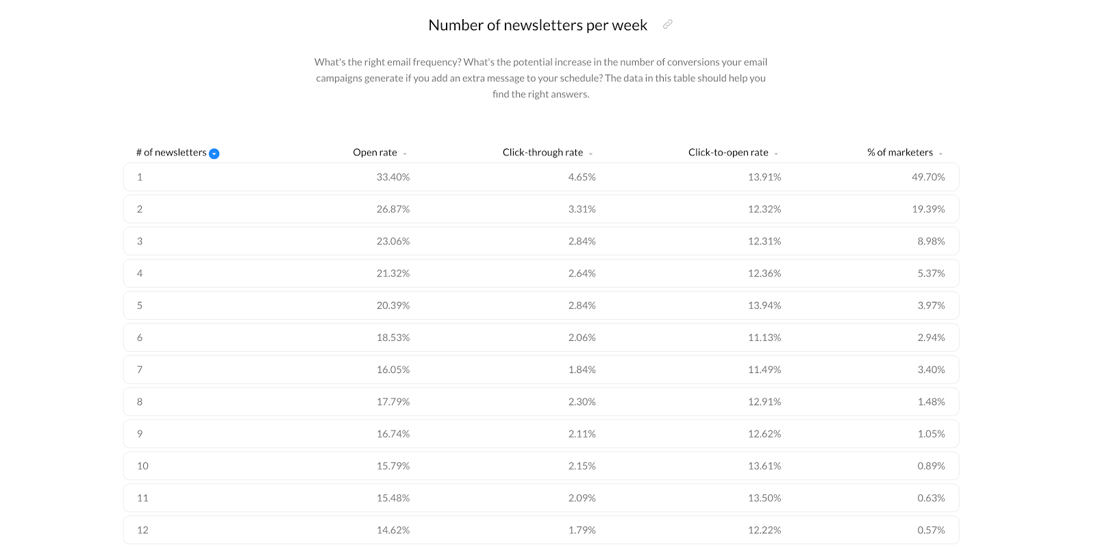
To get inspired, check out this data from GetResponse on how number of newsletters per week correlate with the open rate and click through rate, as well as how many marketers send one, two, and more emails per week:
Choose your frequency and stick to it. Over time, you can start experimenting with other frequencies and see how the change impacts your results!
Step 3: Set clear expectations and attract new subscribers
With the first two steps done, you have everything you need to create a landing page to get new email subscribers.
This is because your subscribe page should set clear expectations and show your potential subscribers what they’ll miss out if they don’t subscribe.
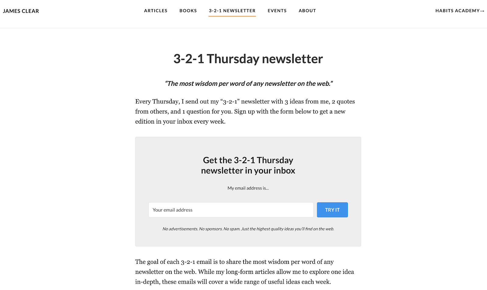
Check out these great examples. The first one is from James Clear, the author of Atomic Habits:
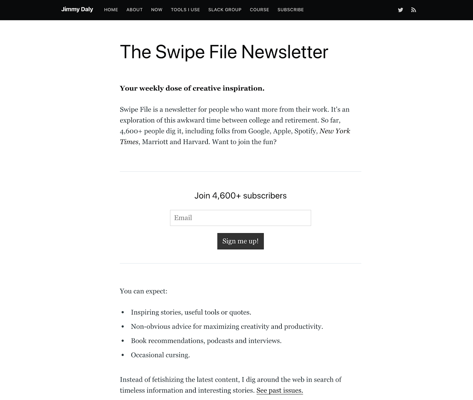
Another great example is one by Jimmy Daly, a content strategist:
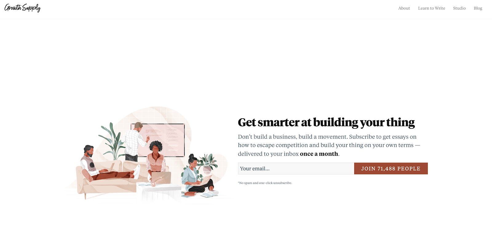
Finally, a powerful example from Growth Supply:
What makes these signup pages great?
- Frequency: “every Thursday,” “weekly dose,” “once a month”
- Content promise: “3 ideas, 2 quotes, 1 question,” “stories, tools, book recommendations,” “essays on how to escape competition”
- Social proof: “join 4,600+ subscribers,” “join 71,488 people”
Based on the previous two steps, you can now easily set expectations about the content and frequency of your newsletter. You can add social proof (as testimonials or the number of subscribers) later on if you don’t have it yet.
Step 4: Make sure your emails get opened
Mailchimp’s data tells us that the average open rate for all industries is 21.33%. It means that, on average, one out of five people will open your emails.
It’s good to know this because it helps you set reasonable expectations and goals. Still, you can take specific steps to ensure your open rate is as high as possible.
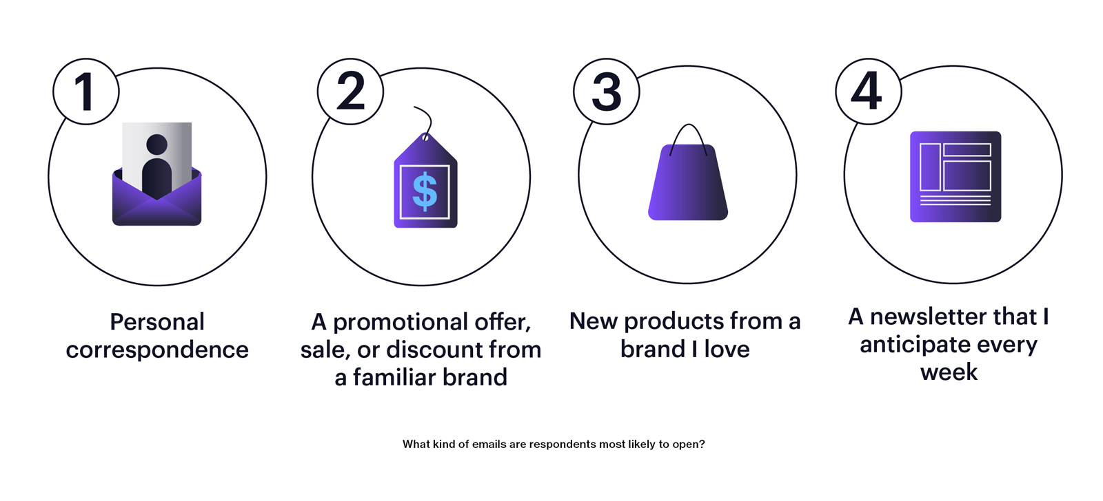
Folks at Campaign Monitor surveyed more than 400 people about the ways they engage with brands through email. When they asked what makes people open emails, here were the main responses:
Let’s look at the main factors your subscribers will look at before choosing to open your email.
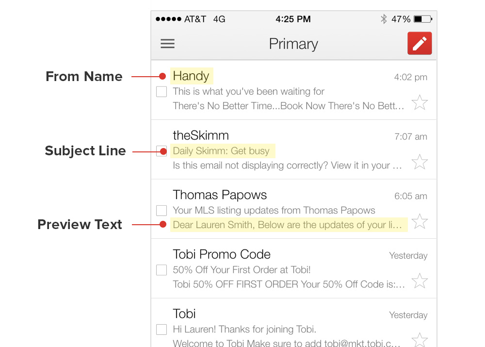
The ‘From’ field
Your email will feel familiar and personal if it looks like it’s sent by a person instead of a company name. However, instead of just using a sender’s name, you can pair it with the company’s name.
This way, your subscriber will know the email is from your company, but also get a sense of one-on-one correspondence.
Here are some great examples in my email inbox:
The subject line
Write your email subject lines with this question in mind: what will make your subscriber think “yes—I need to know what’s inside!”?
Here are some frameworks you can use for your subject lines (and some made up examples to inspire you):
- Ask a question: “Are you struggling with your job search?”
- Tease a specific insight: “How to write content 3x faster”
- Use a number: “5 secrets to a more productive week”
- Get personal: “[Name], you’ll love this one-minute email hack”
As your email list grows, you’ll also be able to run split tests to experiment with variations of a subject line and see which one sparks more opens.
The preview text
The preview text is the snippet of text displayed next to or below the sender name and the subject line.
This text is pulled from the first lines of your email, but you can also hide it with code so that it’s only visible from the main inbox, but not within the email itself.
You can look at preview text as a second subject line—another chance to grab your subscriber’s attention. So instead of reusing your subject line in your preview text, use it to tease some more value from your email.
Check out this guide from Litmus for the code to use if you want to hide your preview text, character counts for preview text across different apps, and more.
Step 5: Deliver engaging emails
It’s time to build out your newsletter content. By this point, you’ve laid a strong foundation, including:
- The main sections of your newsletter
- Your goals
- Your newsletter frequency
Follow these tips to create emails that engage and resonate with your ideal readers and customers.
Value first, selling second
I mentioned earlier that email has a crazy high ROI, which means it’s great for selling your products or services.
But only pushing your products and promotions isn’t the way to make that happen.
Instead, be the place in your reader’s inbox they can go to for the best, most relevant, and most valuable insights on what you’ve promised on your signup page. Common advice is to go for 80/20 or 90/10 ratio of educational/promotional content.
How can you deliver so much value? Here are some suggestions:
- Share your own educational content. Instead of just sharing the link, add a compelling reason for your subscriber to click on it and read it.
- Curate content from other people and companies. This will make you the go-to resource in your industry—check out this guide for more tips on curation for email newsletters.
- Source templates, tools, book recommendations, and anything else that can make your reader better at what they do.
Make your copy simple and skimmable
You can presume your subscriber often won’t have the time or energy to open every link you’ve shared in your email. That’s okay.
To make sure your email is always valuable to them, make it easy for them to skim through it and find what they need the most at that moment.
Here’s a great example from Peloton:
They’ve separated titles from article descriptions so you can quickly get an idea of what each article is about and read the one that resonates the most.
Put yourself in your subscriber’s shoes and structure your newsletter in a way that makes it easy to find the best resource in any moment and on any device.
Use minimal, uncluttered design
Your newsletter is rich with content, so it can become cluttered quickly. We’ve talked about copy, but it’s important to consider design, too.
Make sure to use white space liberally and be selective about how much color and additional design elements you’re using. Links should be far enough apart from each other so it’s easy to click on the right link, even on a small smartphone screen.
This email from LastPass is a great example of clarity supported by design, with numbers and alternating section colors:
Use images that support your content (and make them accessible!)
When we talk about images in emails, there are two main points to keep in mind:
- Only use images that support the written email content (instead of generic stock imagery).
- Make sure your email doesn’t fully rely on the images.
In other words, good images are those that make your copy even better, but the copy would make sense and convey the message even without the images.
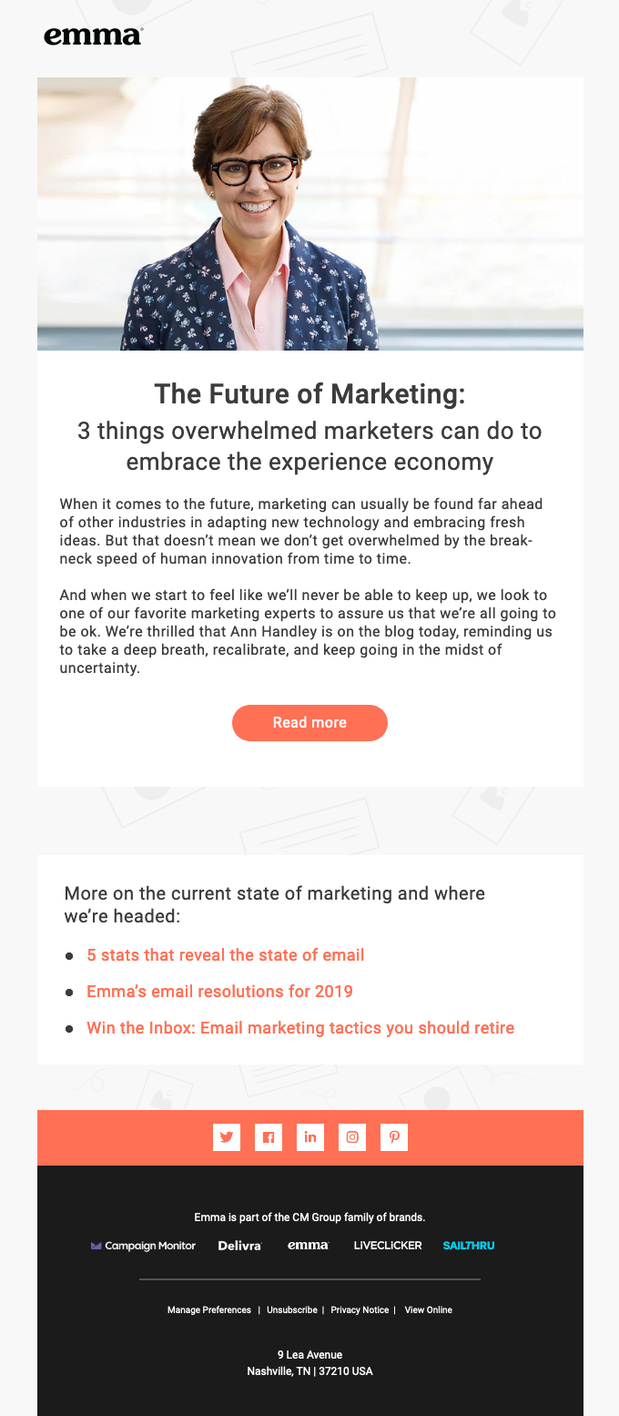
Here’s a great example from Emma’s email about the guest post by Ann Handley:
Ann’s face brightened up the email because it added an even more human element to it—but the email would still make complete sense even without it.
Remember that some of your recipients won’t have images enabled in their email client, so you need to add alt text to your images in case they don’t load. It’s simply the text that will display instead of the image. It will give your subscriber the context even if the image doesn’t load, and it helps those with visual impairments that use screen readers.
Add a main call to action (CTA)
As I mentioned earlier, a clear goal for each newsletter edition will help you pick the best call to action (CTA).
Technically speaking, each of the links you share is a call to action, so it’s important to feature one prominent link or button that is supporting your main goal.
For example, if you shared 7 links to your and third party content, but you want to drive ebook downloads, the ebook CTA needs to be emphasized with copy and design.
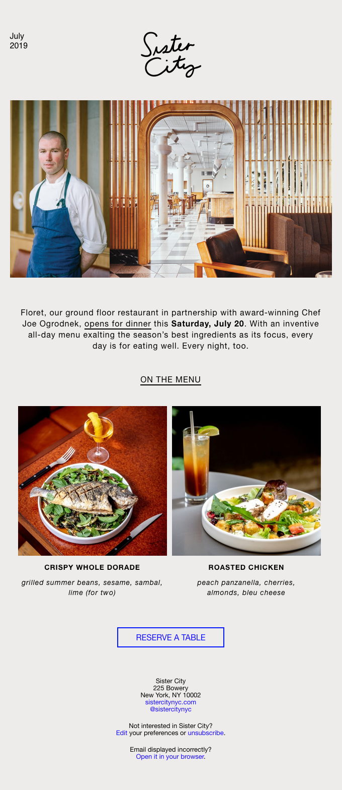
Check out this great example of a prominent main CTA from Sister City, a NYC hotel:
Let them unsubscribe
You’ve worked hard to win your subscribers over. But they should still have full control over who shows up in their inbox, which means you should let them unsubscribe if they want to.
Here are some main things to keep in mind when adding your unsubscribe link at the bottom of your emails:
- Make it obvious. Don’t be clever about it—use the actual word ‘unsubscribe.’
- Offer a way to update preferences. Next to the unsubscribe option, allow them to edit their email preferences (e.g. one email a month instead of weekly).
- Make the process simple. Don’t make them re-enter their email address or email them to confirm they’re unsubscribing. Ideally, use a simple confirmation page.
- Ask them why they unsubscribed. On the confirmation page, ask why they unsubscribed with simple answers as their options. This will help you understand your subscribers better!
Start building a newsletter your audience will love
You now have the steps, examples to inspire you, and practical tips to build an email newsletter your ideal readers will want in their inboxes.
By sharing the best educational content and curated tips, you’ll build a list of loyal subscribers, brand ambassadors, and customers that will keep coming back to you.





 (1 votes, average: 4.00 out of 5)
Thanks for the great tips! I especially appreciate your advice regarding the “From” field because I have been going back and forth on that in my own newsletter for a while, not sure which would be better, but you have a point that it feels more personal coming from a person than a company.