
Email accessibility, in simple words, refers to creating emails with inclusive designs that can be accessed by everyone, regardless of any impairment. If you want to make sure that your email reaches each and every customer, you must make your emails ‘accessible’. Think of the 253 million visually impaired and 300 million colorblind people before you design any email. They might be using adaptive technologies or tools like screen readers, screen magnifiers, eye tracking systems, and advanced sip n puff devices.
Read on to understand all the best practices to make an email accessible to everyone.
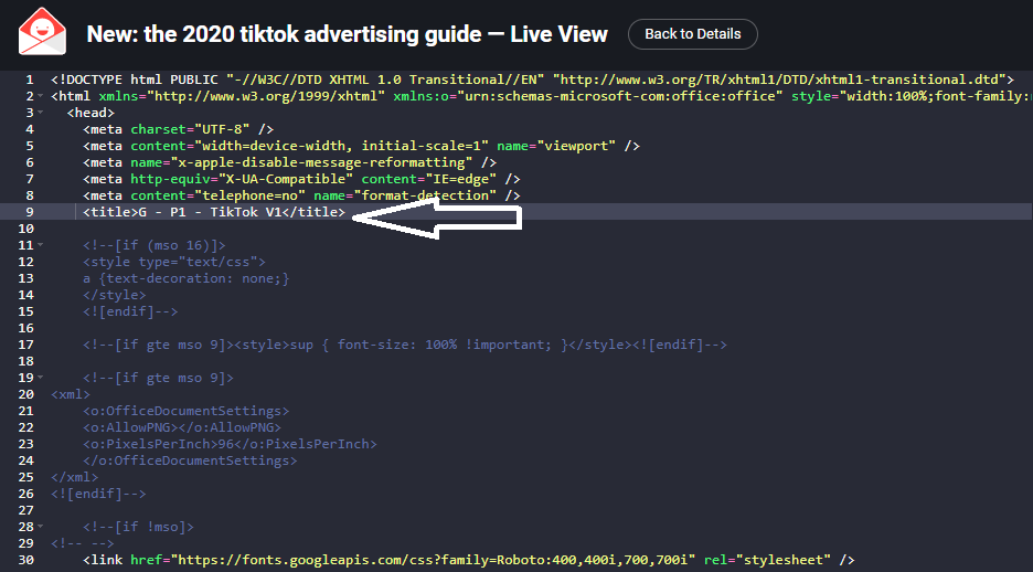
- Always set the email title
Use the <title> tag correctly. Doing so will serve two purposes, namely:
- If the subscriber is viewing the email in a web browser, it will set a title on the webpage tab.
- Secondly, for subscribers using screen readers, it will work as a title and provide some context to them.
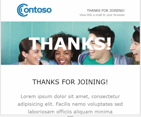
Take a look at the screenshot below to see how Title tag is used.
Source: Really Good Emails
- Encode your characters in the HTML
You must encode the characters in the HTML without fail.
Use this code to do so.
<meta http-equiv=”Content-Type” content=”text/html; charset=utf-8″>
Content-Type influences how the email gets displayed. It will inform the browser or email client about the characters that will be included in the code that follows. This will help to make sure that the recipient’s reading pattern does not break even if they are reading the email through a screen reader. You can take the help of character converter tools for this.
- Avoid setting titles on links
If you set titles on links, it will mislead the screen readers and the reading continuity will be hampered, thereby making the content tough to comprehend. Just use the information you want to provide as the link or part of text.
- Write a suitable alt-text for all the visual elements used
For every visual element that you add in your email, do not forget to add a suitable alt-text for screen readers. This will make the email readable and accessible even if the images are blocked. They can be used to describe images and let the screen readers know what the image is all about.
Take a look at this email by TOPMAN that has included the relevant Alt-text for every visual they have used.
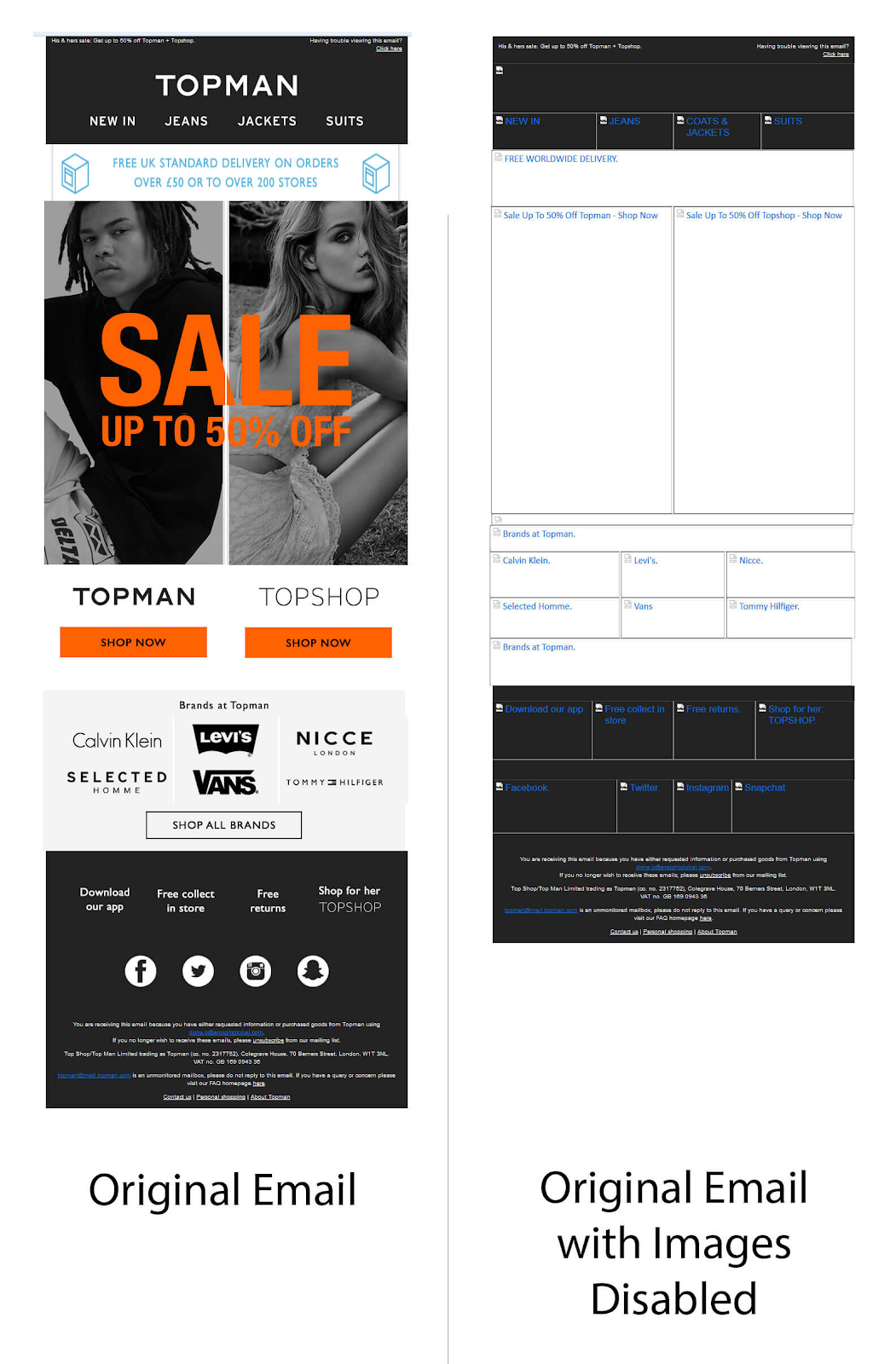
Source: Email Uplers
Note that if you have included an image just for visual appeal, you must add an empty alt=”” on the image. Screen readers will skip such images.
- Take help of semantic code
Semantic code enables screen readers to understand your emails better by differentiating between paragraphs and headings. The subscriber will get a clear idea about what the email wants to convey. <H1> and <P> tags must be used in emails to ensure a smooth reading experience.
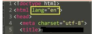
- Use HTML Language Attribute
Often, marketers send out emails in different languages to different subscribers. For example: People in France would receive emails in French while people in the USA would receive them in English (US). To let the screen readers know how to pronounce certain words, you must set the language attribute with the help of lang=””. It will let the devices and systems know how they must display certain words.
Take a look at the different language codes HERE.
The code would look something like this:
Source: https://www.youtube.com/watch?v=pIbqsXXGwys
- Fix the tables
Fixing tables informs the screen readers that it is not a data table, but a presentation table. Just use the code role=”Presentation” and it will make reading email content intuitive for the screen readers. Before sending out any email, you must always test it for such trivial, but important things.
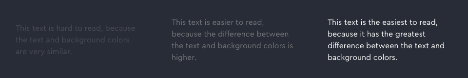
- Set the right contrast ratio
Have you ever read purple text on a blue background? Difficult to read, right? That’s exactly why contrast ratio is of utmost importance. 4.5:1 is the minimum contrast ratio needed, according to the Web Content Accessibility Guidelines (WCAG) 2.0. If you are using a font size of 23px or bold fonts larger than 18px, you can keep the contrast ratio 3:1. A great idea is to have a white font over a black background. No wonder, dark mode is getting so popular, these days.
Take a look at the screenshot below to understand how a higher color contrast makes things easier to read.
Source:https://medium.com/envoy-design/how-to-design-an-accessible-color-scheme-4a13ca12c92b
- Adjust the font size to a minimum of 14px
Make your emails easy to read by using a font size of 14px at the minimum. This size must be adjusted to 16px if you are using a light font like Montserrat.
- Keep a logical reading order in the emails
Subscribers with dyslexia might find it difficult to read your email if you do not follow a logical reading order. Screen readers read left to right before moving on to the next line. Therefore, you must maintain a logical reading flow that makes sense for subscribers and screen readers alike.
- Do not have a center-aligned copy
People having dyslexia can find it particularly difficult to read center-aligned copy. Despite its aesthetic appeal, it lacks accessibility and therefore, it is the safest bet to have left-aligned text in an easy-to-read font face.
Take a look at the center-aligned email below.
Rather than sending an email like this, it is better to send a left-aligned email.
Source: https://community.dynamics.com/365/marketing/f/dynamics-365-for-marketing-forum/372994/marketing-emails-are-always-aligned-at-center
- Place your links such that they are easily accessible
If you plan to use a red CTA in your email, think of the colorblind individuals in your email list. They might not be able to view those links, as a result of which you might miss out on a conversion opportunity. You must always display your links with bold font or by using the symbol >> or with an underline.
- Refrain from using too flashy images or GIFs
Photoepileptic seizures might get worse if you use too flashy GIFs. Use a GIF that ends within five seconds or after three cycles. Content flashing rates at 2 Hz to 55 Hz is likely to aggravate the condition in photosensitive epilepsy. Include GIFs that do not have a high rate of animation and work with smooth transitions.
Do not use such an image that would worsen the symptoms of a photosensitive epileptic patient.
Source: https://www.goodfon.com/wallpaper/explosion-colors-flashy.html

- Test your emails always
As mentioned earlier, never miss out on testing your emails. Email on Acid comes with a Campaign Precheck tool that helps to test the email against all the major accessibility guidelines and easily resolve the issues. The best part of the tool is that it automatically makes revisions to the code without the need to send the email code to the developer.
Bonus tip #15
Many brands use tools like Scoop.it for content curation. They must bear advanced accessibility guidelines in their mind that make the emails inclusive for every subscriber, irrespective of their location, caste, and all those demographic variables. For example: Suppose you are curating content related to Christmas celebrations for your email subscribers in the US and UK. Before doing so, you must keep in mind that people in the UK are keener to celebrate Hanukkah. Such cultural differences should not be overlooked while sending out emails. As a workaround, you can ask the subscribers about their nationality or religious beliefs in the sign up form.
Wrapping Up
Designing accessible emails will mean reaching out to a larger audience and reaching out to a larger audience means increasing the likelihood of conversions.
To sign off, I would like to share a beautiful accessible email by Salesforce to inspire you.
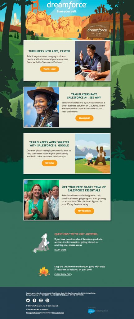
Source: Email Uplers
 (No Ratings Yet)