
The world is functioning very differently now. Most of our communications have gone online. For this method to be effective, visual communication design needs to be a priority.
There are numerous ways to use visual communication to improve internal management systems, such as project planning and organizing.
Visuals are also powerful tools when it comes to engaging with customers, both in the B2B and B2C sectors.
But what is visual communication design? Why is it important for businesses? In this guide, we explain the basics of visual communication and how businesses can leverage it.
What is Visual Communication Design?
Visual communication designs incorporate visual elements to convey messages, but also to evoke emotions and actions. This graphic explains how the visual process works.
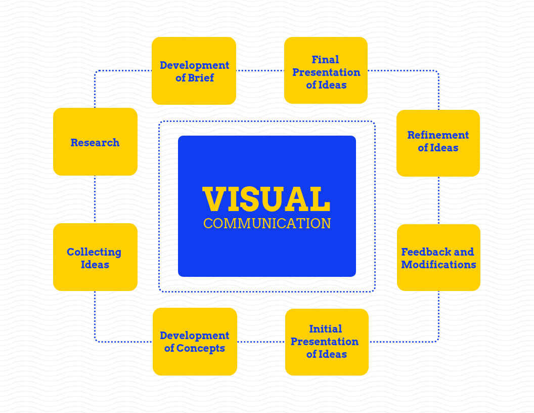
Source: Venngage
Taking the above graphic as an example, one can see how visual communication flows from concept to presentation.
We could have listed the points in a table or bulleted list, but the visual is easy to connect with.
That is where the power of great design comes in. Visuals not only educate the user but also engage them with design principles.
There is another aspect of visual design that has grown in popularity—data storytelling, which is described below.
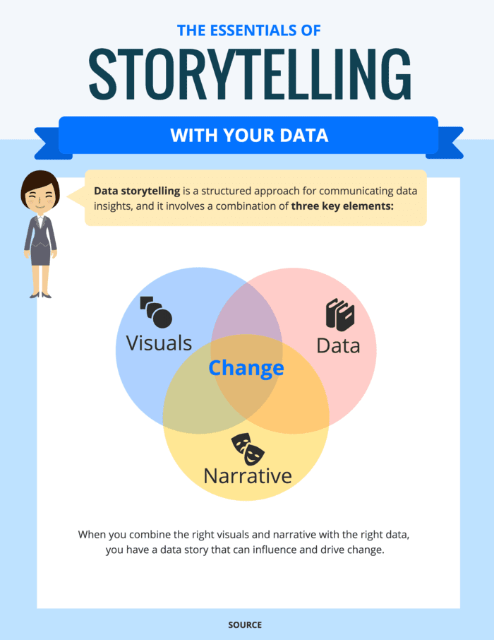
Source: Venngage
Sharing raw data as-is can be confusing for users, whereas displaying data in a visual helps them see patterns and connections they otherwise would have missed.
If visual communication design and data storytelling are connected, how are they different from graphic design?
Visual Communication vs Graphic Design
There is a difference between visual communication and graphic design. Graphic design is a very specialized field. It focuses on the creation of visual elements.
However, visual design is more generalized and can envelope multiple communication disciplines to share messages.
Visual communication and design are connected through graphic design—essentially, graphic design is one part of a bigger whole.
Why is Visual Communication Important?
There is one primary reason why visual communication has become so important for businesses—online users simply don’t have the time to read huge blocks of text.
According to the Nielsen Norman Group, user attention spans on a webpage decrease drastically after just 10 seconds.
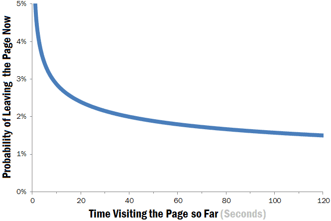
How can businesses keep visitors’ interest? By reducing their labor with visual designs.
Don’t rely on words to do all the work. Design visuals that create connections and explain concepts to users from all walks of life.
Here are the ways businesses can use visual design in their communication strategies:
- Simplify complex data
- Communicate complex information
- Tell data stories
- Engage audiences
- Evoke emotions and actions
Now we know why visual communication is important but what elements does it comprise?
What Comprises Visual Communication Design?
Visual communication design includes the following elements:
- AR/ VR
- Brand identity
- Data visualizations
- Diagrams
- Flow charts
- Infographics
- Interactive content
- Mind maps
- Presentations
- Printed collaterals
- Reports
- Roadmaps
We outline how businesses can create some of these visual communication materials to improve how they connect with customers.
How Can Businesses Improve Visual Communication Design?
In this section, we share some visual communication examples that will highlight how businesses can use imagery to boost their user connections.
-
Create Data Visualizations
We’ve mentioned how data stories have become important in the communication space. These stories can best be conveyed through data visualizations.
Businesses can use a chart maker to design data visuals according to the categories illustrated in the graphic below.
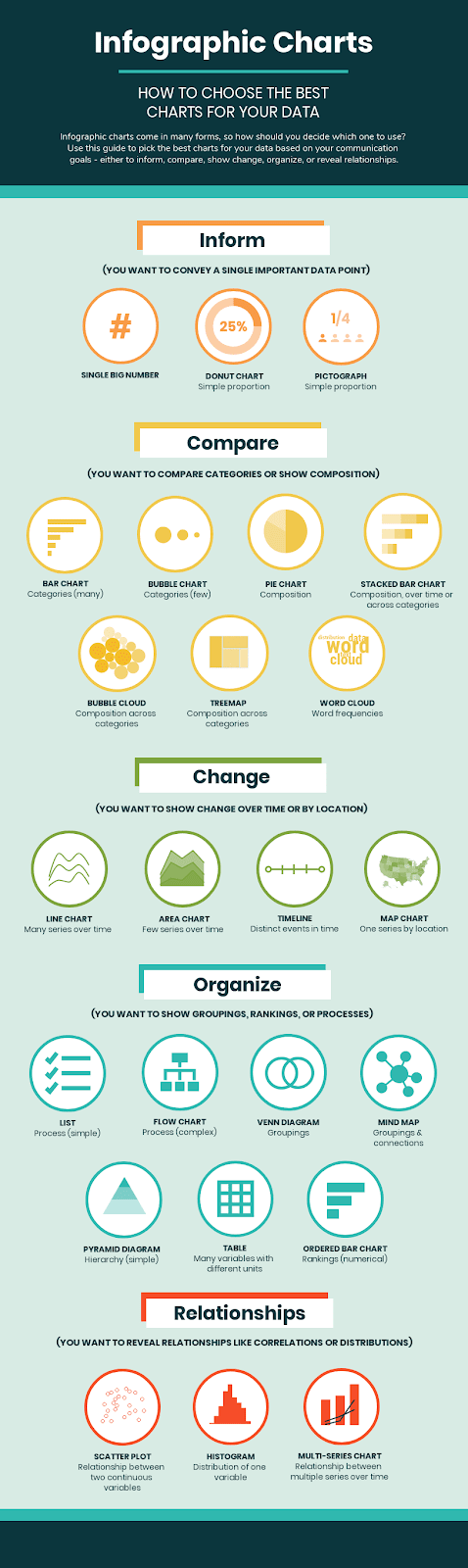
Source: Venngage
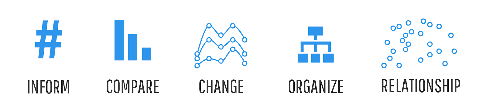
For businesses that aren’t sure what charts to create for which content, it’s best to use the ICCOR method:
- Inform: do you have a single data point to convey?
- Compare: do you want to share the similarities or differences between data?
- Change: do you want to show how trends have changed over time or space?
- Organize: do you want to show how groups are connected or ranked?
- Relationships: do you want to show how variables or values correlate?
Source: Venngage
Plan out the message before you start designing. This will make it easier to define your goals and choose charts that will be most effective for your audience.
-
Use Visual Elements
Increasing engagement is one of the core aims of visual communication design. How can you accomplish this without using visual elements?
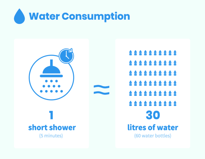
One of the best visuals to use in graphics is icons. Look at the simplicity of this design.
Source: Venngage
By using icons of bottles, this graphic correlates how much water is used during a 5-minute shower.
Could the above visual have been shared in words? Yes, but it would have required so much more work from the audience. And, it would have been boring.
Instead, by using visual elements like icons, you’ve managed to tell a memorable story to your audience.
Plus, this kind of visual is easy to add to a blog post and share on social media to increase brand awareness.
-
Use Visual Metaphors
Another great way to visually communicate your message is through metaphors. Now, we usually think of metaphors as words and phrases, but they can also be conveyed visually.
This visual communication example uses running metaphors to explain the importance of NPS—net promoter score.
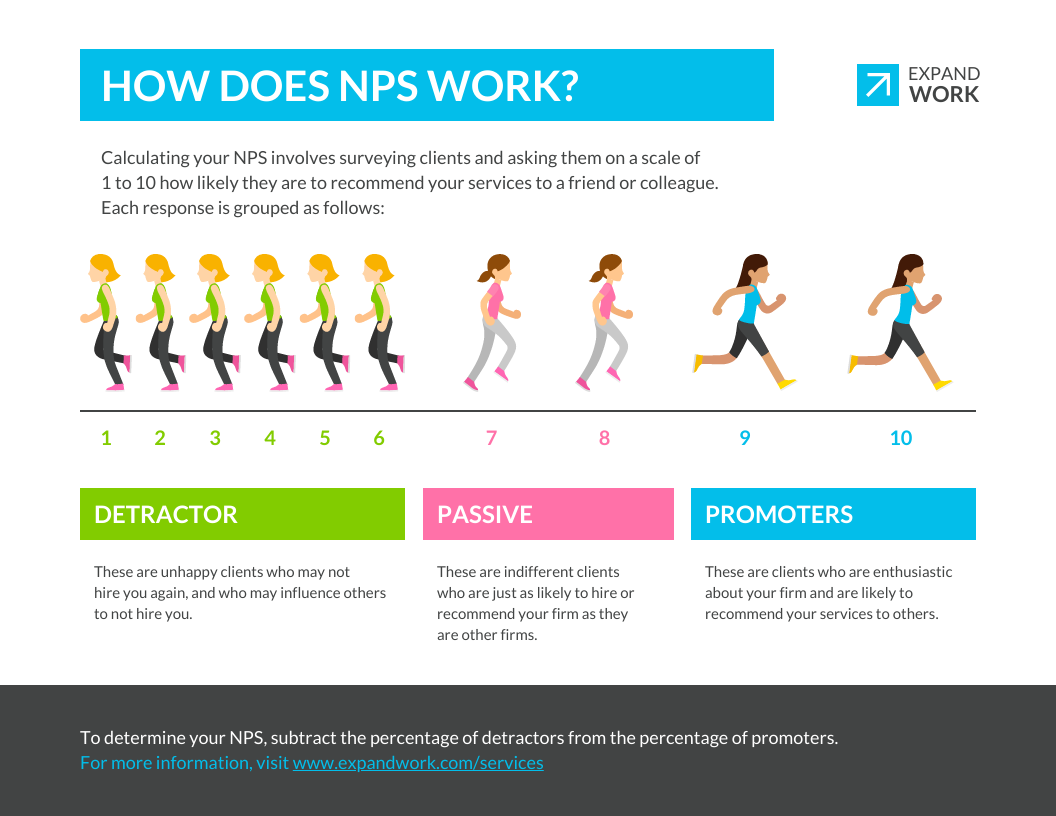
Source: Venngage
The icons of the runners make it much easier to understand what NPS is useful for and why it should be a priority for businesses.
-
Create Flow
Flow is paramount in visual communication. You can create a great design but if you haven’t thought about how the audience will follow the visual, the process won’t work.
For example, take a look at this roadmap. Why is it so easy to know where the eye needs to go next so the message is coherent?
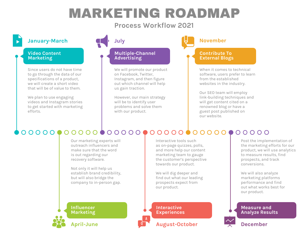
Source: Venngage
It’s because the roadmap has clear demarcations between sections. The change of colors allows the user to know that a new set of information is being presented.
How can businesses follow this method when making their designs? The graphic below explains the columns and sections included in an infographic layout.
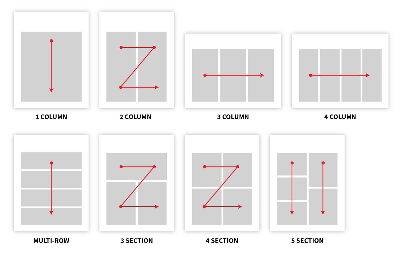
Source: Venngage
The arrows show how one can order the information so that it’s optimized for the way the human eye flows.
Follow these design rules when creating your visuals so that your message makes sense to the user.
-
Cut Down on Text Use
We’ve been discussing visual design here so, of course, the text shouldn’t be the primary focus of your visuals.
But this is still a necessary point to make because we are geared to include as much text as possible.
Look at it this way, if your visual needs more text for people to understand it, then you haven’t used the right visual elements.
For example, the presentation below doesn’t eliminate all the text, but it does rely on icons and graphs to tell the bulk of its story.
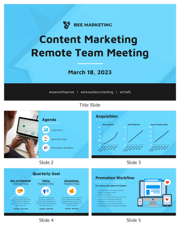
Source: Venngage
Whatever text you include should be used to highlight important information. Don’t rely on text to tell your whole story.
-
Design Checklists
A checklist does include a fair amount of text but the visual layout makes it easy to follow and understand.
The SEO checklist below conveys complex details to users but the step-by-step format helps the eye flow down the graphic easily.
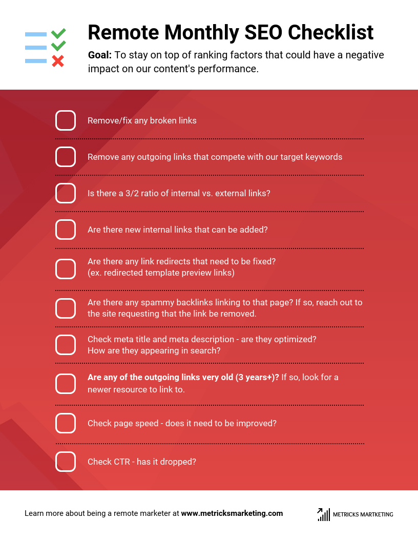
Source: Venngage
In addition to the simple style, checklists condense the amount of text included—most of the sentences are no more than two lines.
This makes the graphic easy to skim—users can glance through it without having to focus too much of their energy.
Checklists are great tools for internal visual communication design. They make processes more effective and relatable.
Conclusion: Prioritize Visual Communication Design in 2021
Visual communication has become more important than before. Businesses need to prioritize this style of communication in 2021 and beyond.
We’ve shared the reasons why visual communication is necessary in the world of business, as well as some key ways to use visual designs to improve communication with customers.

 (No Ratings Yet)